For my project I had to create a concept that involved photographing the possibility of double identities within females. At first, it took me some time to arrive at this idea as my chosen path to follow as I couldn't decide which one I should pursue. Despite this, I feel as though I had consistent effort throughout, doing multiple photo shoots for tests, and defining it's final style every time I did. I did a lot of my research hunting at the beginning where I had to define the visual style etc.
I believe I followed directions given to me. In my tutorials, notably the last one, I was told to concentrate on the creation of my output ideas before the deadline, and that's exactly what I did. I made preliminary photographs in my tests, and found photographs similar to what I wanted to achieve in my own in the hope that it would aid my visual style, and I believe that it did. My artist research also helped define the issue within my concept, so that I could specify the detail within my concept.
For the composition of my work, I have creating three sets of pairs, each pair of photographs have one subject within. The subject presented themselves dressed at home leisurely when they weren't in the company of others, and the second photo was how they would - more specifically if they were to be at a social event like a club or bar. This composition lead to the creation of half faces. I would place the two photos side-by-side, the left photo had the right half of her face (usually the one without make-up), and the right photo had the left side of their face, how they would dress themselves up. This composition created a binary opposition within each pair which was a powerful comparison for the work in my opinion. I printed A3+ as this was the ideal size for my presentation. I wanted them to be viewable within their own space, but I also wanted to respect the wishes of the subjects by not 'exposing' them at unnatural sizes - therefore A3+ seemed like a healthy compromise for me and the females I shot. For my printing process I used Photo Lutre paper, as I wanted a premium feel with a slight shine on the paper. I would hope to mount them with a wooden frame behind each photo if it were possible, but such a process was time consuming and very costly for a student.
I chose to balance out my photographs in the best way possible. I did nothing fancy in my exportation of RAW files, besides some slight split toning. Originally I created a stronger feeling of purple in the dark areas, and yellow in the light, but it was slightly distracting, so I toned it down to a minimal amount that you can barely see - I wanted to include these colours as these are the favourable colours of my artistic style. If I could do it again, I would possibly try shooting in the studio, despite the idea of shooting each photograph in the homes of the subjects. With a studio shoot I could define shadows and lighting and maybe create a more artistic feel, but overall I am happy with my outcome. The lens I used to shoot each photograph was actually a 105mm lens on a cropped sensor, therefore making the actual size around 150mm. This process actually flattened any features on the canvas - and for a reason. I didn't want to create the sense of depth, I wanted the photos to be at one with the background. Making them flat meant that you focused more on appearances physically. You could look at details and make comparisons more easily as most facial features would appear roughly the same in shape.
Overall I am happy with the work I have made, and I am confident that I have made something worth thinking about. I believe my work can make a difference to those who care about the issues presented, and I hope I can continue to do so with more of my work in the future.
Samuel Horne
Monday, 29 April 2013
Sunday, 28 April 2013
Final Body of Work
In my final body of work, I have chosen to go with six final images to represent my project's concept. I feel as though I have reached the epitome of my results as I have refined my process through reshooting with ideal settings. My previous photo shoots were successful and acceptable, but I wished to better my process and create higher quality images - this is because the previous shoots I took of all the head and shoulders, whereas these final shoots I positioned the camera at a precise distance from each subject whilst shooting in the homes of each subject. Through my final showcase, you can see the transformation between the before and after, each representing the person they are in their homes and while they are relaxed, and then the dressed up 'best' version of themselves, the version they believe they should be when going out to various social occasions like clubs and bars. Please take time to examine and appreciate the differences they behold, so that you may benefit the stories behind each change.


Retouching & Workflow Workshop
Layers
When working with layers, make "darker" and "lighter" curve layers, then make them black (either by selecting the little white square or pressing the slash), then paint on. By doing so, you can paint on the adjustment layer instead of it affecting the whole document.
To make the photograph look like a Mannequin copy these settings:
(Top layer)Other > High pass 9.1
(Underneath layer) Noise > Median
Overlay on Top Layer
Make black (alt+backspace)
Digital Workflow
1. Digital capture
2. Download to PC
3. Organize photos (apply keywords and create groups), and choose selects
4. Raw conversion of selects from an edit
5. Digital Retouching
6. Output
7. Archive
RULE: No more than ISO 50 or 100 on H1D
H1D: Body with Digital Back
HC 2.8/80mm lens
Imagebank
Hassalblad link cable
FireWire 400 lead
Handgrip battery
Quick release
Wooden block
Tripod screw
Lightmeter
Grey card
Layer groups order:
Mark up
GLOBAL ADJ
LOCAL ADJ
DODGE & BURN
PIXEL LAYER
(RETOUCH & SPOT/DUST)
BACKGROUND
Methodology Output - Exhibition
Through looking at what I want to achieve, I am getting to the stage where I have a rough idea of how I wish to proceed with my project after I've created my body of work. With two halves of a face on each side of a book, one might suggest that it makes sense to establish some sort of 'flick book' or journal full of my images. I'm here to say that I am choosing not to do so, and here's why.
My work is not something where you can 'flick through' and expect to grasp it's concept. Quite the opposite. I would expect that viewers take the take to really examine the detail within. Spot the differences, pick out and dissect the two opposing sides that the characters deliver, only then will you fully grasp the depth of my concept.
Make-up can be bold, but it can also be subtle. These subtle differences may be all that each person believes transforms them to an acceptable standard. For such subtleties to available for examination, I must present on a larger scale.
For my output, I would hold an exhibition. This exhibition will not feature other people, and by having room for just me, it gives the audience focus on the concept at hand, and undoubtedly creates space for reflection.
Where?
The exhibition would be held at the Nucleus Arts gallery shop in Rochester. This is not to be easily confused with any gallery spaces they also own for such an occasion. For the shop's clean-cut furnishing style, and comfortably-sized store, I would ask of them that I could set up a three-day long exhibition of my work. Reasons for choosing such a place would be that:
- It isn't too big, therefore it's justifiable for one exhibitor
- It's local, which means those of whom I consider important can easily turn up
- The shop itself supports a wide variety of artwork, being an eclectic store


How?
With an opportunity like this where I can freely express my artwork, the Nucleus Arts Shop has the perfectly sized place for me to set up my shots for display. Without sounding unreasonable, I would run a fundraiser to help me assist with costs to cover them over the three days.
For Lighting, I would choose to have fairly traditional Ceiling spotlights, the type that can illuminate a strip of wall. These lights are ideal for drawing focus on the artwork that really matters. By using such lights, I will keep the audience focused on what is important.

Thankfully for the me, the shop comes equipped with ceiling spotlights that match the exact style that I want, so all I would require for further insurance is to ask if it's acceptable that I use such lights for my own exhibition.
Print Size
The subject of print size another controversial issue. I wish for viewers to examine the characters, but I do not wish to 'expose' those included either. This balance has informed my decision to print at a respectable size of A3+. A3 itself was a little too modest, not quite presenting the photograph for all it is. A2 was a good size, but it was starting to show them off as some sort of models in a grand experiment - and I wanted to pay my respects to those who were happy to include themselves in my project, and keep the size relatively safe. Thus informing my decision for A3+/Super A3, creating a healthy balance between the two points.
Mounting/Framing
After looking at many frames, none really stood out as helpful towards aiding my body work's message. Ultimately, frames in general were a hindrance to fulfilling clear and concise communication. The border was a break between the pairs of images, and was more of a visual barrier than anything else. So I have settled to go with a mounting of some sort. I would not print onto a canvas, but I would prefer my images on glossy photo paper that can then be placed onto either a wooden mount, or foam board. Foam board would be a cheap answer, but I feel it does not reflect the value at which each image should be considered. I feel there is a sense of value to be had from the images, and therefore I would prefer that value be shown - foam board does not show that. n my ideal situation, the photographs would be first mounted onto a thin layer of MDF wood to give it stability beyond the paper. From there, I would then have a wooden frame cut to size around the edge of the back. I would prefer this wood be painted white before mounted onto the back.
My work is not something where you can 'flick through' and expect to grasp it's concept. Quite the opposite. I would expect that viewers take the take to really examine the detail within. Spot the differences, pick out and dissect the two opposing sides that the characters deliver, only then will you fully grasp the depth of my concept.
Make-up can be bold, but it can also be subtle. These subtle differences may be all that each person believes transforms them to an acceptable standard. For such subtleties to available for examination, I must present on a larger scale.
For my output, I would hold an exhibition. This exhibition will not feature other people, and by having room for just me, it gives the audience focus on the concept at hand, and undoubtedly creates space for reflection.
Where?
The exhibition would be held at the Nucleus Arts gallery shop in Rochester. This is not to be easily confused with any gallery spaces they also own for such an occasion. For the shop's clean-cut furnishing style, and comfortably-sized store, I would ask of them that I could set up a three-day long exhibition of my work. Reasons for choosing such a place would be that:
- It isn't too big, therefore it's justifiable for one exhibitor
- It's local, which means those of whom I consider important can easily turn up
- The shop itself supports a wide variety of artwork, being an eclectic store

How?
With an opportunity like this where I can freely express my artwork, the Nucleus Arts Shop has the perfectly sized place for me to set up my shots for display. Without sounding unreasonable, I would run a fundraiser to help me assist with costs to cover them over the three days.
For Lighting, I would choose to have fairly traditional Ceiling spotlights, the type that can illuminate a strip of wall. These lights are ideal for drawing focus on the artwork that really matters. By using such lights, I will keep the audience focused on what is important.
Thankfully for the me, the shop comes equipped with ceiling spotlights that match the exact style that I want, so all I would require for further insurance is to ask if it's acceptable that I use such lights for my own exhibition.
Print Size
The subject of print size another controversial issue. I wish for viewers to examine the characters, but I do not wish to 'expose' those included either. This balance has informed my decision to print at a respectable size of A3+. A3 itself was a little too modest, not quite presenting the photograph for all it is. A2 was a good size, but it was starting to show them off as some sort of models in a grand experiment - and I wanted to pay my respects to those who were happy to include themselves in my project, and keep the size relatively safe. Thus informing my decision for A3+/Super A3, creating a healthy balance between the two points.
Mounting/Framing
After looking at many frames, none really stood out as helpful towards aiding my body work's message. Ultimately, frames in general were a hindrance to fulfilling clear and concise communication. The border was a break between the pairs of images, and was more of a visual barrier than anything else. So I have settled to go with a mounting of some sort. I would not print onto a canvas, but I would prefer my images on glossy photo paper that can then be placed onto either a wooden mount, or foam board. Foam board would be a cheap answer, but I feel it does not reflect the value at which each image should be considered. I feel there is a sense of value to be had from the images, and therefore I would prefer that value be shown - foam board does not show that. n my ideal situation, the photographs would be first mounted onto a thin layer of MDF wood to give it stability beyond the paper. From there, I would then have a wooden frame cut to size around the edge of the back. I would prefer this wood be painted white before mounted onto the back.
Saturday, 27 April 2013
Double Identity Test Shots - Before and After


As you can see, these are my tests. I originally wanted to capture the essence of each person's 'before' and 'after' shot as a passport photo, this was a preliminary placeholder pose for characters as I hadn't fully decided on my final outcome. I wanted the photos to be natural, I didn't want to create any sort of staged attributes when shooting, aside from the compulsory passport style. They could be whatever they wanted within the frame.
From my experience of doing this, I could begin to see the changes in emotion through their transformation from the person they are inside, and the person they are outside. There is a real sense of dual personality playing within most of the portraits for me, and the difference in emotion was interesting. Whilst some portraits give small indications towards feeling happier in make-up, many girls looked and felt more relaxed being themselves without any modifications. The battle between the two appearances for me needed to be amplified with some clever camera positioning.
After editing through the photos (as previewed in a previous post) you can see that the split halves of the face works very well, but for technical reasons, the quality of my initial set of photographs did not live up to the standards I wanted, especially since I was shooting the whole face and then cropping. I needed to photograph with extreme precision emphasized on the positioning, and the amount of face filling up the frame.
Friday, 19 April 2013
Initial Shot Cropping & Framing
These four initials shots that I've processed are of a few models I may use for my final. You have a photo where I asked them to be themselves as they would be at home. For the other picture, I asked them to be who they would be when they are going out to a party/club. These are the shots:


After I had conducted these shots, I could see that there are transformations from before and after that was completely their choice. They could be the same, but in each photograph from before and after, they make the active choice of modifying their appearance. I wanted to re-create the framing and link the photographs together so that they link. This is initially what I Had:


After I had conducted these shots, I could see that there are transformations from before and after that was completely their choice. They could be the same, but in each photograph from before and after, they make the active choice of modifying their appearance. I wanted to re-create the framing and link the photographs together so that they link. This is initially what I Had:


First Shot Combination


Second Shot Combination
As you can see, the faces may not be completely symmetrical, but I was never sure of this set up. Trying to combine them as one person is almost against the message I'm trying to create. Seeing as the shots are of them as two different people (essentially their aesthetics recreate them, they need to be more separate, so I came up with this set up, still in the same Diptych style:


This now creates binary opposites of the two conflicting aesthetics that they present themselves in, and truly shows opposites between one look and the other. This maximizes the changes between the two different sides of each girl and makes it easy to see the parts that have undergone modification.
After this experimentation, I have decided that I shall present all my final images like these ones, and these may both feature in my final set after I complete all the photographs.
Twiggy

I post this image purely for it's aesthetic value. The style of which Twiggy conveys her emotion is strong, yet calm. This passport-style photograph is one of my favourites, and I would like to create a similar feeling within my imagery, through very similar expressions and photographic framing. The contrast shown is also something I may factor in.
Thursday, 18 April 2013
Aesthetics Inspirations
Within this post I shall show different visual inspirations, and how they will affect my final aesthetic. This post is to help me define exactly what I want my project to be in hopes I can narrow down the visual translation of my final idea.
------------

This first image for me shows a double indentity, almost as though the same person can be two different people, who's ideologies conflict and contradict. This idea of one person being two people is exactly what I want to communicate, except the difference being that they are aesthetically different, transforming what they look like so that they may be "acceptable" outside.

I picked this for the positioning and the amount that you can see in the image, also it shows as another example of this double imagery that I can see in my mind of how I want to present.

This hideous before and after is a scary example of how a girl is seen to be transforming herself. This image in particular though features a girl which is clearly of a younger age, barely even a teenager. Yet she is bombarded with this sexual ideals of the modern adult world, and assumes that her body must meets these "extra" requirements. Something like this should not even be of a concern for girl of this age, her mind should be developing elsewhere rather than being concerned of her looks.
.jpg)
With a before and after here, you can see lots of differences in the second image compared to the first - all courtesy of Photoshop. This particular transformation has smoothed out skin, created a slightly warmer tone in it, and removed wrinkles where necessary. The colours have also been deepened, and her entire facial shape slightly restructured for something more pleasing. Not only is this image lying to the female viewers, but it's dangerous for those who believe it to actually be true of how women should look. Those who believe so will then aspire to recreate, constantly trying to achieve the perfect Photoshop female who does not exist. A great example being the girl in the image before.

This is a very good representation of how I believe my project will turn out, although I'm not sure if I will join them, currently. The girl clearly shows two sides, one with a complete set of tools used to create a new look (lipstick, blusher, eye liner, etc) compared to everything removed. These opposition would not be the same for most men, so why should it be that most women would do it?
Another example where she has completed the same process in one picture. Why should it be that make-up is needed? Why should it be that we do not appreciate the aesthetics of femininity in human nature? This girl is beautiful without make-up, and yet she is inclined to cover herself. This imagery is where I draw my inspiration for my final shoots.
The Feminine Ideal - Marianna Thesander
After reading through various sections, it is clear that the feminine idealogy of being "transformed" into something else goes a long way back. Right at the beginning of the book, The Feminine Ideal quotes Margarat Mitchell's Gone With The Wind when saying "Pull them tighter, Lou. See if you can make it eighteen-and-a-half inches, or I can't get into any of my dresses." This mentality of shrouding your body with make-up, or in this case, pulling a corset so that it modifies your body's shape more.
Several pages in, and you find a great question: Who produces the varying physical expressions? And why is it especially the female body that has, in the course of history, been endowed with specific symbolic significance?
This very question intrigues me. The female body is symbolic, it holds a lot of significance for important things - the main one being life. So, to dress up the body as a sacred place for growing life would not be strange, and it's likely how that has happened. But that happened a long time ago. Humans have evolved, and so has the ceremony of dressing the woman's body.
This dressing up became ceremonial, the woman's body became a place of ever-altering "physical ideals" as Thesander puts it. These physical ideals, according to Thesander, can be split up into 4;
- The Status Image
- Morality, Perception of the Body, and Aesthetics
- Dress and Fashion
- Propagation of the Fashion Ideal
Monday, 15 April 2013
Methodology Notes
Methodology - The way that you research something
Method - The way you achieve your finished product
Jackson Pollock
- gestural painting
- Summertime: Number 9A 1948
Robert Rauschenberg
- untitled 1963
- 1996
- 1996
Christo and Jeanne Claude - Over the River
Christo & The Arkansas
Christo & The Arkansas
Catherine Yass
- Lighthouse 2011
- Corridors 1994
- Lighthouse 2011
- Corridors 1994
Ori Gersht - Evaders, Far Off Mountains and Rivers
Helen Sear
- Sightlines - 2011
- Twice Once
- Sightlines - 2011
- Twice Once
Mark Power
- The Shipping Forecast
- The Shipping Forecast
Hiroshi Sugimoto
- Lighting Fields.
- Lighting Fields.
Rob and Nick Carter
- Paint Pigment Photograph
- Paint Pigment Photograph
Gillian Wearing
- Self Portrait 2003
- Self Portrait 2003
Adam Fuss
- Untitled 2007
- Untitled 2007
Mike and Doug Stark
- Attracted to Light
- Attracted to Light
Sandra Kantanen
"Shadow images" Plato
"Shadow images" Plato
Sunday, 14 April 2013
Marina Abramovic - Female Conformity
Whilst looking through notes, I came across a performance/video by Marina Abramovic that tells of feminist conformity. In this video, starring herself, Abramovic repeats a saying "Art must be beautiful, Artist must be beautiful". Through this repetition, the audience is almost put into a trance of reflection upon the words she speaks, and as a result, you can begin to see the psychotic murmurs within herself.
Here you shall see an image which is essentially a 'contact sheet' of clips taken from the video she has produced:

FRAMES OF THE VIDEO - Marina Abramovic brushing her hair
After this repetitive process has had time to sink in, you notice the subtle messages of 'conformity' leak out onto you. Her hair is continuously brushed in an effort to remain relevant among society. The process of repeating this implies an insanity that many females have to deal with in their own individual way on a daily basis. Abramovic sustains this intensity through constant brushing, and with a cycle like this, you can never find a resolution.
This attitude and behaviour saddens me, the idea that females must present themselves on a repetitive basis creates needless effort for an audience who may or may not be asking it of them. Those who are expecting such things should reconsider their values and why it matters, and as for those who aren't they can easily speak of their indifference towards make-up and 'dress up' in general. When a girl goes out thinking 'dress to impress', they promote the visual presentation without making room for the inner personality to shine through.
Aesthetically speaking, the underlying message isn't immediately available, and I like that. The imagery is calm and constructed, yet the message builds up over healthy reflection. This practice is something I shall aim to incorporate within my final images.
Further Inspirational Images
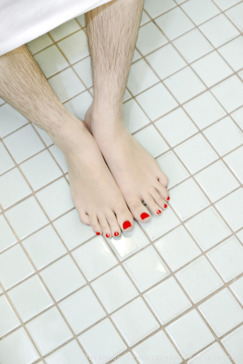
Similar to Rhiannon Schneiderman's previous photo I had shown, this one declares individualism and strength in one's uniqueness. The hairy legs play as a binary opposite to the painted nails, showing the dual self-image within one. The series "Lady Manes" has images similar to this on her personal website.
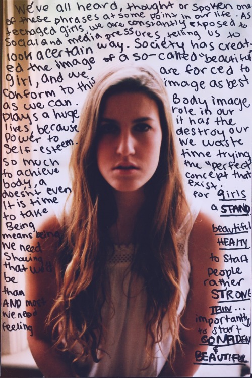
As the writing in the photograph explains it, self-esteem is strongly affected by the words and reactions that society throws at us. Dressing yourself up isn't compulsory, nor is it expected. These thoughts are often expressed or seen time and time again.

This image does not represent something that was intended for this subject, but I feel its relevance was high towards my project. The transformation she is undergoing alters her lips' colour and shine, covering up the natural beauty of an untouched pair of lips. Beauty can be found everywhere if you look hard enough, and this image shows the covering up of a great example.

For me there is a sense of irony within this photo that I found. The face has been drenched in make-up, and the woman appears to be enduring what looks like a painfully precise moment. The eyes have become something else. They no longer shine the colour of skin, but merely show an unnecessary sense of extras where they are clearly an annoyance - this annoyance may not stop females from presenting themselves differently, as some may feel it is a necessity for acceptance.
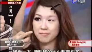
In this image taken as a screenshot from an asian TV programme, you can see a women has applied make-up to one of her eyes whilst leaving the other blank. Looking into it, you can find that the girl endures 'eyelid taping' as a way to make her eyes look bigger and therefore more captivating. The fact that an individual would go through great lengths to better her appearance for the sake of improvement for onlookers makes me sad. Other things mentioned around this subject was plastic surgery, and how that was an 'option' to make improvements.
'Double Identity' - Initial Research
Now that I have an initial start for my idea, I have began exploring the further development, to specify what the idea is, and what I'm going to produce at the end. Researching the terms of feminist self-image and double identity I have come across many artist/photographers that can aid my project's momentum. Double identity can be a result of social gatherings encouraging certain behaviours and demanding fashions that transform you for the sake of a greater conformity. This split lifestyle can be seen throughout culture and the world.


MELANIE KLEIN - Healing (my) Mind, Body & Spirit.
The first artist who I came across, Melanie Klein, who in this image chooses to show a double identity through a mirrored reflection of a female character. As she sits there, she is seen reflecting upon her own physical image, exploring expressions along the way. Upon further inspection, you can see that the character has lipstick and a hairbrush, among other things, that clearly shows the experimentation of alternating your own appearance. For me, this shows that many young females are exposed to this lifestyle of alternation, showing that (for some reason) females tend to apply facial modifications, along with hair that has gone through its own transformation. These explorations distill an ideal that encourages you to be something more than yourself - aka, wear make up.
GEOFF CORDNER - I'm Sorry That I Think
This next photographer I found has a different take on the harm that identity endures. This depiction of a naked female with her own thoughts written on her skin shows that a fragility has taken damage. The nudity of the female exposes a mortality that physically takes on the words of those who say hateful things. Written upon her body, you can see thoughts and feelings that are reactions within her mind to those things that are inflicted against her, this shows the power that words can have, both against her and from her own thoughts. To me, this shows a battle that greatly involves and affects her appearance, that her body absorbs the words spoken to her, be it positive or in this case negative. This work can influence or indeed empower the idea of a double identity, presenting yourself as two different people according to who you're with. As an extension of this particular image, there is also a great screenshot within One Tree Hill, which is an American television drama, showing one of the main characters showing a similar image:
As you can see, the words of people are inflicted upon you, and the exposure of that can be enlightening for those who do not know of the implications their words have upon somebody.
RHIANNON SCHNEIDERMAN - A self portrait from the "Lady Manes" series
This photograph in particular empowers the woman with one identity, showing only your true self. The idea here is that she exaggerates the imperfections brilliantly, as a response to the expected conformity that the male society has come to expect of females. The retaliation is clearly seen through the use of scruffy hair, a stern expression, and particular outgoing rugged footwear. This attacks that idea of expectation and with the aid of her own self, shows an accelerated pubic growth which may be seen as an abnormality. The male audience may shudder at the idea, but it does create a memorable image.
This presentation is firmly set on showing individualism through a constructed image. For my project, I wish for a more considerate, documentative approach that allows the audience to see both sides of a story, without creating bias.
Saturday, 13 April 2013
Methodology concept: Double Identity
After looking at all of my ideas, I can confirm that my idea will be called 'Double Identity' and will be focusing on females. Female culture throughout the history is known for its dualism of personality, presenting one ideal whilst at social occasions and gatherings, while contrastingly being somebody of minimal 'presentation' when they aren't outside. It's almost as if they feel compelled towards dressing up in order to fit in. The name 'Double Identity' goes right to the point - I want to explore the idea that females display a dual personality, either through necessity, conformity, or simply for confidence - all of which derive from the same issue.
Through this exploration, I hope to perform first hand 'research' that will provide me with the results of this hypothesis, so that I and many others may discover the truth behind this dual personality issue, and whether it is something significant that we should consider more.
Methodology Creative Process
In a lecture covering the Methodology brief, we as a whole group of photography students were encouraged to think of 10 quick ideas within 1 minute to empower our creative process and come up with some initial ideas to focus on at the preliminary stage of our development process.
In the list, I came up with these quick ideas:
Ultimately I wanted to explore the 'Double Identity' task more, as it's exposure would help people consider that girls are not explicitly required to present themselves as something they are not, where they could just as easily go to outings with a more natural appearance.
In the list, I came up with these quick ideas:
- Timeless locations - Looking at locations that never change, despite an ever advancing world. This would likely focus on places that are surrounded by technologically advanced areas, but the place itself doesn't. Wasn't sure about how strong of an idea this was.
- Fractal's in Nature - This project would focus on the natural patterns that you could find within nature itself, namely fractals, symmetry, and similar stuff. This idea would need more depth and more of an objective.
- Double identity - Essentially this idea stemmed from 'the portrait is a lie' which was my essay title, I am exploring and experimenting with the idea that females present themselves in two different lights - a casual hidden and care-free appearance usually at home, and a dressed up, modified version of themselves when 'out' at clubs or parties. This idea calls for an open discussion about make-up and natural beauty.
Ultimately I wanted to explore the 'Double Identity' task more, as it's exposure would help people consider that girls are not explicitly required to present themselves as something they are not, where they could just as easily go to outings with a more natural appearance.
Subscribe to:
Posts (Atom)