Friday 27 December 2013

Simon Roberts: We English

'We English' describes the project of which Simon Roberts has documented much of the English heritage and lifestyle held within a large exhibition, with the focus mainly being with landscapes and their incredible visuals that they behold. He would photograph people at a distance, almost as a tip of the hat towards classical painting, but in a modern and contemporary manner. His objective almost clear way of photographing is inspirational for a documentary type landscape, and it encourages me not to worry too much about creating a photographs individualism so much, whether that is intention or not.


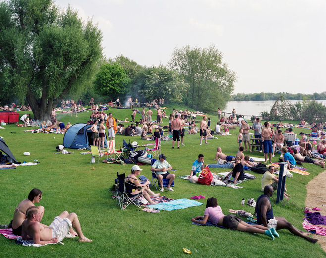
The image above is a classic example of such a British photograph, showing many people gathered for a fairly overcast day, a few making BBQs for food - which is all fairly British. The real image in question I choose to dissect out of its collection to show separately, as I feel its significance to my project cannot go unheard. Simon Roberts, who came and spoke at UCA last year, showed a diligence to complete his work for this project and keep the method the same running throughout, which I think is something important to remember.


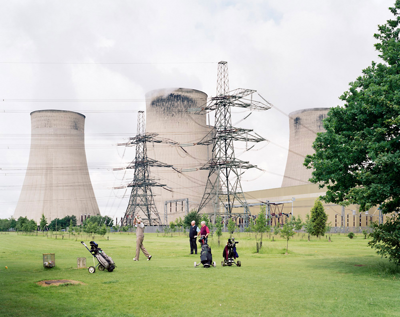
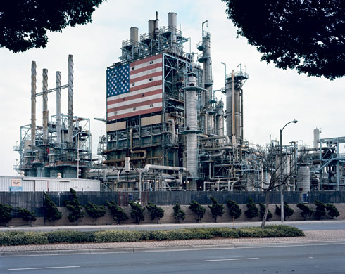
I have spoken about this image before as a very influential piece for those concerned with tackling the subject of climate change in general, but it feels that there's a certain ignorance with these golfers that cannot go unnoticed. The dull, grey subject matter of the background has become like a numb pain to all those surrounding, people have become accustomed to the smoke rising from the towers commonly known as chimneys, although I feel this misrepresents their size. Visually, I feel there is a divide between the foreground and background, much like Mitch Epstein's work before - the green grass and edge of the tall tree shows nature blossoming, with a few trees in the background next to the cascading grey matter which proceeds afterwards. There are definite binary opposites at work - you could cut the image in half and wouldn't expect to see either subject matter featuring on both images.

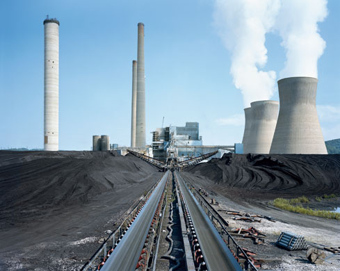
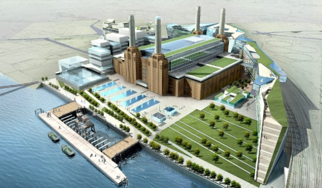
The place of which this was taken is Ratcliffe-on-Soar, which is in Nottinghamshire. Such a place like this cannot go unnoticed, and I plan to make a trip to see the facility as soon as I possibly can, along with a few others. Once I have accumulated 3 or 4 places to see, I shall do a little tour around a few places in UK so that I may too gather my own material.


Thursday 5 December 2013

BBC Documentary: When Coal Was King

I've taken it upon myself to watch the BBC documentary about Coal miners back in the 1950s, where they would decidedly record every moment they could of the social, economical, and industrial differences and advances as they were happening. On the January 1st, 1947, signs were affixed to all collieries to say that they were to be managed by the National Coal Board, something that was born out of the labour government on behalf of the people. The declaration of focus upon Coal was a way in which the country publicly declared it's social renewal after World War 2. This then prompted the NCB to set up the film unit so that they can document every happening of the coal industry.


This is a screenshot taken of the BBC programme in which they hung the signs declaring the newfound existence of the NCB. Every month, 'The Mining Review' was a reel of film or a cine-magazine at a fairly short length of 10 minutes which was sent out to cinemas for all the millions of people within the public to keep up-to-date with the happenings of the mining world. One particular place it was shown was London's West End theatre, among 800 other cinemas. This was all to make sure that the public were all kept informed of the mining as they were now partly paying for it through their tax contributions, but it was also to show the mining communities at work and at play, and how those two things converged in such a thriving industry. 


Each mining review often followed a formula; firstly it would show technical information highlighting the latest developments within the mining industry. The rest of the short film would show arts or music, showing content created by the mining community in their spare time, finishing off with a story that usually promoted the benefits of mining. These fascinating archives were a truly successful way for the general public to give approval to mining coal. The labouring hours that were put into a typical worker's day kept many people employed during the few decades in which it thrived, but thanks to Margaret Thatcher's conservative party being in power during the UK miner's strike, many were turned by the success of Coal, and it's popularity decreased considerably. This was probably a good thing in the larger scheme of things, as it brought Coal under a more critical light, proving to many that it wasn't going to be a sustainable source, and the mining review films showed that desperation.


As the mining review clips were nearing their end, you could see the signifiant resounding words to be true, where it was mentioned that Coal would "not only power us for the next 40 years, but also for the next 400 years", which was the truth, but it failed to mention that there were other forces in play. The environment certainly took its toll during this period, and the implications from current modern ideas investing in wind farming and solar panels are a clear sign that many people are acknowledging the problem that exists.


Thursday 21 November 2013

Major Project Shoot (Photoshoot #1)

This is my first open collection of images, slightly altered in colour to represent what I strive to show in my final set of images at Free Range at the end of the year. Comments are completely welcome, as long as they critically aid in improving my methods for the next time.


These photos taken represented my first attempt to scour the area for places I could visit further. Unfortunately, my stay was cut short by the appalling weather. I arrived at Grain, camera in hand, and an empty SD card. Isle of Grain was a great place to start off as it gave me somewhere to explore a widely varying cluster of facilities, all in the energy business. Much like Epstein, the comment is subtle, leaving the viewer to take in what is presented.


Many places were far away or simply out of reach due to their distance of security or deliberate placing of the facility. In a power-hungry world, we are greeted with those over-bearing electrical statues all interconnected, and fuelling the world with their wires showing to the world. It's amazing that we as a society are still burning rock-like materials as fuels for the modern generation of slim technology and snazzy gadgetry.


The appearance of the buildings are all so dull, and many taint the surrounding lakes, marshes, and plants. Personally, I believe they stick out like sore thumbs, and are unattractive. But there has to be a compromise for a world increasingly power-needy. Our country has many of these places dotted around the countryside, desperately trying to bodge in and blend their way into obscurity, without causing trouble. Yet, the damage is greater than just visual appearance.


Tuesday 12 November 2013

Mitch Epstein: American Power

As my project focuses heavily on the observation of the energy industry but with a critical eye, it makes complete sense to look at somebody who has done it all already; Mitch Epstein. In his project aptly named American Power, he has essentially gone around as some sort of energy sightseer, touring America to find each power station facility far and wide in all their glory nakedness. He spent 5 years conducting his exposition of these places to help give clarity to their connected purposes, be it strengths, weaknesses or in some cases abandonment. It's worth bearing in mind, this project took place in the post-9/11 Bush era where everybody was on their toes about security and any endangering activity. According to The Guardian, he was regularly stopped, searched, followed, and even run out of town. (http://www.theguardian.com/environment/2009/oct/03/mitch-epstein-power-plants-photographs)


In the above image, you can see BP Carson Refinery in California. He took this in 2007, and published it in 2009 with Black River Productions. The aesthetic complexity of the facility provides a somewhat pleasing experience for onlookers, and the exposure Epstein has captured provides a warm yet somewhat overcast image of the place. In the image, the mechanical architecture is visually boxed in by the nature that surrounds it, almost a metaphor for the threatening ability that comes as an implication towards what these facilities are capable of doing to nature as a whole. These simple landscapes combine as something more, they have a certain silent comment attached about political and corporate power, which provides Epstein with freedom and ability to show the world what these places truly behold when they are seen bare from the public view. John Vidal says in a separate Guardian article "Epstein photographed coal mines, solar arrays, oilfields, half-empty dams, smokestacks, fuel cells, nuclear plants and pipelines, but also many of the things the most energy-profligate nation on earth does with all that power – such as build Las Vegas and golf courses in the desert, send tanks to Iraq, blow the tops off mountains to find coal, make nuclear bombs and electric chairs." All these photographs can be caption-free and still make a difference to viewers when the images are presented as one.
(http://www.theguardian.com/environment/2009/oct/03/mitch-epstein-power-plants-photographs)


This image is taken of Amos coal power plant, in Winfield, West Virginia, 2007. The Guardian claims that his pictures, he says, show the 'beauty and terror of early 21st-century America as it clings to past comforts and gropes for a more sensible future', a future with no current direction. This very tedious and exasperated method of energy creation has served its time for many decades, but the method has had little implication of bettering the world long-term whilst it does its job.


This image particular sticks out as a subtle way of showing where technology and nature blend in together fairly seamlessly. There is an argument to be had here as to whether this successfully merges the two or creates an imbalance of binary opposites. Taken in Altamont Pass wind farm, California, we can see the Wind Farm sits among nature with little more than a wave of some kind of blade placed out of harms way. With an exception to birds, this method does nothing to interrupt the nature surrounding it, aside from a visual disturbance for humans. Those who choose to complain about such facilities should reflect on the fact that there are truly worse things that could be seen, such as a very large chimney outputting harmful gas.


In this instance, my point is a little more obvious - this truly separates the foreground from the background. This image also shows Amos coal power plant, Raymond City, West ­Virginia, taken in 2004. The presence of greenery; trees and grass amongst the quaint little houses, all of it is interrupt by the gargantuan chimneys cascading in the background as towers. Aside from those who appreciate architecture, most people would believe this to be the true distraction, visually. Epstein has created a whole set of brilliantly captured photographs, with great composition, binary opposition, and comment. He will greatly influence my photography for this project.

Thursday 7 November 2013

A Look At Hydraulic Fracturing

Hydraulic Fracturing, which is also commonly referred to as Fracking, is the new kid on the block for energy creation. The name lends itself to the process of fracturing the rock deep under ground - this method is used in multiple ways for extraction purposes. The most common material being to release shale gas, tight oil, or any other valuable limited supply locked away in rocks that were previously unreachable. The water is usually mixed with sand or grit to help grind away at the available cracks hidden deep within the ground, these are known as fissures. These fissures can be as little as 1mm across before the grit gets to them, the grit then helps keep the fissures open for the extraction of sources that are deemed useful. The drill is usually sent downwards, then after a period of time, it's sent horizontal for miles at a time so that the whole rocky layer is exasperated of it's locked away resources.


The whole 'Fracking' process has come under a lot of fire with environmentalists as the sites where it takes place require transport of water in very large amounts, at a cost to the surrounding area. The process of which a drill has to gouge out huge holes within the rocks is a permanent thing, once the drilling is complete, that natural rock will always show gaping wells within the ground, and only for a limited benefit. The implications of destroying something permanently for a short fix (in the grand scheme of things) is a concern of many organisations, including Friends of the Earth. One spokesperson on behalf of this organisation, spoke for the BBC; "Shale gas is not the solution to the UK's energy challenges," said Tony Bosworth, Friends of the Earth energy campaigner. "We need a 21st century energy revolution based on efficiency and renewables, not more fossil fuels that will add to climate change."

Hydraulic Fracturing is just another way to avoid creating a modern energy solution for the growing problem of climate change, in a world with a limited number of years remaining before our worldly habitat becomes ever more dangerous for general living, and the resources we use are depleted to the point at which we would need to find another solution anyway. Fracking is only a diversion from the true problem that we face as a generation of people that need electricity for almost everything that we do, even the most mundane of tasks.


Monday 4 November 2013

Temple of Power


The Temple of Power describes an energy facility that existed in 1940, but has since been decommissioned. Battersea Power Station, as it is formally known, actually only had 2 chimneys until around 1950, when the extra two were added. Needless to say, it was decommissioned within 1983, due to it's machinery wearing itself out, and the drifting of Coal as the industry leader for electricity creation. It was in 1980 that the boiler house roof was removed to help aid the process of removing a lot of the machinery.

The chimney's CO2 emissions can be seen lifting skywards as the industry's heavy reliance upon Coal had aided us in creating the next-generation of technology. Coal is still a fuel we choose to aid us in our creation, but as the environmental concerns creeped in, we have shifted a little ways towards wind-generated power sources, wave breaks, and some places choose to incorporate solar power - although this usually happens on a company by company basis. This monumental building truly showed us what capability we have in the coal industry, but also the potential destruction it can cause to our environment. The output of Carbon Dioxide into the atmosphere is slowly warming the planet, the very fact that this building isn't operational anymore is an initial step towards achieving a coal-free environment.


The remains of the building are now being renovated to create blocks of flats around it, and a shopping centre within the main building of Battersea Power Station. As you can see above, the building has already got mock-ups of its potential visual. The reuse of such a wonderful artefact will prolong its relevance within modern society, whilst also maintaining a hint towards its heroic past as a power house for energy creation. One step closer to a coal-free environment, one step closer to reducing CO2.


Saturday 26 October 2013

Edgar Martins: The Time Machine

In 2010, Edgar Martins was granted access to around 20 power stations facilities within Portugal so that he may photograph the interior and show the world. Many of those facilities were actually built between 1950 and 1970, "a time of hopeful prospects for rapid economic growth and social change" according to dissfussionfestival.org. They go on to speak of his work as a way of documenting a period in time of which the facilities' design was intentionally progressive as a way to testify to the scope and ambition of the original vision they were built to serve. 
(http://www.diffusionfestival.org/programme-item/the-time-machine/)

This work brings a sense of nostalgia to the industrial designs well known from 1970s science-fiction films and TV shows. The work, almost dated in itself, brings a sense of attempted harmony, but with a hint of neglect as the photo presents itself in isolation from any human operation.


As you can see above, the control room is readily available for use and operation, yet the contact and human interaction is almost nonexistent. The surfaces are clear, pristine, almost untouched. The centralised subject shows a cohesive look at the overall symmetry within the room, yet the cleanliness almost lends itself to being a novelty than a tool. The flooring shows it withheld the weight of many feet, and the steps have almost taken their toll whilst the tools show a binary opposite. This eerily opposing imagery is both aesthetically pleasing, and saddening. 


It's saddening to see that such a grand facility would be abandoned, the opportunities it has left behind, laying in the dust of the previous human presence. The ever-evolving has chosen against keeping this wonderful place from creating electricity for us. I think it's worth noting that all of these facilities are hydro-electricity power plants. Now, as a society, I believe we've not properly looked at the most opportunistic options for energy creation, and we aren't much further in finding a sustainable reliable source that can provide energy for us at a substantial rate. Hydro-electricity was a safe option for humans as the proximity of the water itself was no issue whatsoever, unlike the other nuclear options that many are exploring today. It isn't a criticism, it's more a reflection of my own opinion that as a world we haven't entirely found a solution that presents itself as safe that has great potential. 


The real beauty of Edgar Martins' "The Time Machine" is the symmetry, perfect dimensions, and overall order within his set of images that ominously sets it apart from the contrasting messiness that is human nature, and yet we created it. The centralisation of much of the imagery is visually pleasing, and is a great send-off for a place that served well, but didn't use up its time. The retrograde colouring is a tribute to a design era that we should be proud of. You can find the whole set of 64 photographs here on his website. (http://www.edgarmartins.com/work/the-time-machine-an-incomplete-semi-objective-survey-of-hydropower-stations-2011/)


Wednesday 23 October 2013

Sparks of Interest

When I was figuring out what I wanted to write about, photograph, have an opinion on, I felt stumped right at the beginning of the year, I had no idea what I was going to look at for my Final Major Project. I was soon given a mini project task of finding an image that would be seen on the front of a newspaper, often because something special was to be happening with it. I thought it would be worth noting that my Major Project idea was sparked off of this miniature project where I had photographed the Battersea Power Station in all its remaining glory. 


I took this photo as a task which didn't present itself with a specific message needed, but more as an image that you may find in the newspaper for whatever reason. I wasn't aware however, that Battersea was under renovation to be created into a large complex of flats and shops, and this image certainly lent itself as something that may suggest this beautiful building was to becomes something more. I was also told of how this image was aesthetically pleasing, but didn't immediately suggest that it was related to energy. This sparked my interest to start looking into observing where modern society is with energy. 

Sunday 20 October 2013

The Facts and Politics of Non-renewables

The difficult position we have put ourselves in as a modern society is not to be taken lightly. Currently, the world is usurping resources that are not renewable, these are often referred to as Non-renewable energy. This consists of Fossil fuels and Radioactive fuels. Fossil fuels include Petroleum (crude oil) which is split up into several densities and types, Coal, which is the largest source of energy, and natural gas, which is fairly self-explanatory, originating from places where the creation of the gas excludes a man-made process.

These natural resources are of limited supply, a limited supply within our world, and the outcome of using these fuels as energy is wasteful and isn't ideal as a solution to our energy needs. Radioactive fuels are the other side of the coin, a same limited supply material, but completely different in context. Uranium is the material used, and has no other applicability, aside from being dangerous for humans in near contact. This makes it slightly more appealing as a fuel, since it is naturally harmful for our race. This creates the basis for a slightly more trustworthy fuel, despite it's non-renewable status. Many companies take advantage of uranium in nuclear power stations, but since there are dangers within the process and the waste product must be contained or disposed of in a correct manner, we are safer with coal, petroleum, and natural gases.


Petroleum, the finite resource used within many modern cars, is the substance behind many political debates. We rely heavily on oil companies to give us the fuel we need for our cars that take us everywhere, since walking isn't always an option, and driving is the easiest way to travel a great distance in a short amount of time. We have millions of cars in use, many of which are old, some people are still driving cars that are 20 years old and still serve as a tool to get from A to B. Unfortunately, the older models are expectedly worse for their emissions. Oilprice.com has a written piece surrounding the affects at which these oil companies do not wish to see their profits removed or change. In an article written late 2012, they are quoted saying:

"U.S. Rep. John Boehner, speaker of the House of Representatives, received nearly twice as much financial support from donors tied to the energy sector than did the next-closest recipient, a report from the National Wildlife Federation finds. The 20-page report highlights the role it says oil companies play in U.S. politics, stating energy companies are working behind the scenes on Capitol Hill to influence legislation in favour of oil, natural gas and coal policies. The NWF report finds that the current 112th U.S. Congress has voted one out of every five times against legislation drafted in favour of environmental issues."
[Taken from http://oilprice.com/Energy/Crude-Oil/Big-Oil-Funding-U.S.-Politics.html]

This shocking behaviour comes as no surprise to those within the political arena, those parties that battle it out within the American's Congress just to prolong the issues that are inevitably present - not just for American companies, but also worldwide. I wish to explore these political and environmental issues, not necessarily with the intention of being uniquely different in my approach, but to help rally up support for the warped wrongdoing of the companies producing the energy we all use, and the implications of their ignorance.

Monday 14 October 2013

An Objective Look At Energy

Within my final major project, I will be expected to draw upon the skills and knowledge that I have developed over the past few years whilst being at UCA. I choose to look at something with real world value, a subject of great importance and significance to current society. My initial plan would be to look at the subject of Energy. It's purpose is intrinsic to every modern day activity, within electronic devices, cars, and major corporations. More specifically, I choose to focus on the issues surrounding energy creation, and the numerous ways in which it can be harvested.

For starters, coal has always been a standard fuel in which we burn to transform into the electricity we know, love, and depend on. This fuel is of limited supply, as is that of natural gases. Thus, we have chosen nuclear as an option too, which unfortunately is a dangerous subject to go down, and the current method produces a large amount of waste, only 1% of the product used for nuclear is actually usable in today's current methods.

CO2 is the gas we output most of in the world, as it serves to be fairly safe for human breathing as it's the same gas we exhale. But as the appetite of the world increases exponentially by the year, one has to question the use of non-renewable sources for our energy, and the destruction it may be causing in the long-term. I plan on delving deeper into this subject to find out just how this affects us, if and how it may affect the current generation's future.

Monday 29 April 2013

Double Identity - Self Evaluation

For my project I had to create a concept that involved photographing the possibility of double identities within females. At first, it took me some time to arrive at this idea as my chosen path to follow as I couldn't decide which one I should pursue. Despite this, I feel as though I had consistent effort throughout, doing multiple photo shoots for tests, and defining it's final style every time I did. I did a lot of my research hunting at the beginning where I had to define the visual style etc.

I believe I followed directions given to me. In my tutorials, notably the last one, I was told to concentrate on the creation of my output ideas before the deadline, and that's exactly what I did. I made preliminary photographs in my tests, and found photographs similar to what I wanted to achieve in my own in the hope that it would aid my visual style, and I believe that it did. My artist research also helped define the issue within my concept, so that I could specify the detail within my concept.

For the composition of my work, I have creating three sets of pairs, each pair of photographs have one subject within. The subject presented themselves dressed at home leisurely when they weren't in the company of others, and the second photo was how they would - more specifically if they were to be at a social event like a club or bar. This composition lead to the creation of half faces. I would place the two photos side-by-side, the left photo had the right half of her face (usually the one without make-up), and the right photo had the left side of their face, how they would dress themselves up. This composition created a binary opposition within each pair which was a powerful comparison for the work in my opinion. I printed A3+ as this was the ideal size for my presentation. I wanted them to be viewable within their own space, but I also wanted to respect the wishes of the subjects by not 'exposing' them at unnatural sizes - therefore A3+ seemed like a healthy compromise for me and the females I shot. For my printing process I used Photo Lutre paper, as I wanted a premium feel with a slight shine on the paper. I would hope to mount them with a wooden frame behind each photo if it were possible, but such a process was time consuming and very costly for a student.

I chose to balance out my photographs in the best way possible. I did  nothing fancy in my exportation of RAW files, besides some slight split toning. Originally I created a stronger feeling of purple in the dark areas, and yellow in the light, but it was slightly distracting, so I toned it down to a minimal amount that you can barely see - I wanted to include these colours as these are the favourable colours of my artistic style. If I could do it again, I would possibly try shooting in the studio, despite the idea of shooting each photograph in the homes of the subjects. With a studio shoot I could define shadows and lighting and maybe create a more artistic feel, but overall I am happy with my outcome. The lens I used to shoot each photograph was actually a 105mm lens on a cropped sensor, therefore making the actual size around 150mm. This process actually flattened any features on the canvas - and for a reason. I didn't want to create the sense of depth, I wanted the photos to be at one with the background. Making them flat meant that you focused more on appearances physically. You could look at  details and make comparisons more easily as most facial features would appear roughly the same in shape.

Overall I am happy with the work I have made, and I am confident that I have made something worth thinking about. I believe my work can make a difference to those who care about the issues presented, and I hope I can continue to do so with more of my work in the future.

Samuel Horne

Sunday 28 April 2013

Final Body of Work

In my final body of work, I have chosen to go with six final images to represent my project's concept. I feel as though I have reached the epitome of my results as I have refined my process through reshooting with ideal settings. My previous photo shoots were successful and acceptable, but I wished to better my process and create higher quality images - this is because the previous shoots I took of all the head and shoulders, whereas these final shoots I positioned the camera at a precise distance from each subject whilst shooting in the homes of each subject. Through my final showcase, you can see the transformation between the before and after, each representing the person they are in their homes and while they are relaxed, and then the dressed up 'best' version of themselves, the version they believe they should be when going out to various social occasions like clubs and bars. Please take time to examine and appreciate the differences they behold, so that you may benefit the stories behind each change.


Retouching & Workflow Workshop


Layers

When working with layers, make "darker" and "lighter" curve layers, then make them black (either by selecting the little white square or pressing the slash), then paint on. By doing so, you can paint on the adjustment layer instead of it affecting the whole document.

To make the photograph look like a Mannequin copy these settings:
(Top layer)Other > High pass 9.1
(Underneath layer) Noise > Median

Overlay on Top Layer
Make black (alt+backspace)

Digital Workflow


1. Digital capture
2. Download to PC
3. Organize photos (apply keywords and create groups), and choose selects
4. Raw conversion of selects from an edit
5. Digital Retouching
6. Output
7. Archive

RULE: No more than ISO 50 or 100 on H1D

H1D: Body with Digital Back
HC 2.8/80mm lens
Imagebank
Hassalblad link cable
FireWire 400 lead
Handgrip battery
Quick release
Wooden block
Tripod screw
Lightmeter
Grey card

Layer groups order:

Mark up
GLOBAL ADJ
LOCAL ADJ
DODGE & BURN
PIXEL LAYER
(RETOUCH & SPOT/DUST)
BACKGROUND

Methodology Output - Exhibition

Through looking at what I want to achieve, I am getting to the stage where I have a rough idea of how I wish to proceed with my project after I've created my body of work. With two halves of a face on each side of a book, one might suggest that it makes sense to establish some sort of 'flick book' or journal full of my images. I'm here to say that I am choosing not to do so, and here's why.

My work is not something where you can 'flick through' and expect to grasp it's concept. Quite the opposite. I would expect that viewers take the take to really examine the detail within. Spot the differences, pick out and dissect the two opposing sides that the characters deliver, only then will you fully grasp the depth of my concept.

Make-up can be bold, but it can also be subtle. These subtle differences may be all that each person believes transforms them to an acceptable standard. For such subtleties to available for examination, I must present on a larger scale.

For my output, I would hold an exhibition. This exhibition will not feature other people, and by having room for just me, it gives the audience focus on the concept at hand, and undoubtedly creates space for reflection.

Where?

The exhibition would be held at the Nucleus Arts gallery shop in Rochester. This is not to be easily confused with any gallery spaces they also own for such an occasion. For the shop's clean-cut furnishing style, and comfortably-sized store, I would ask of them that I could set up a three-day long exhibition of my work. Reasons for choosing such a place would be that:

- It isn't too big, therefore it's justifiable for one exhibitor
- It's local, which means those of whom I consider important can easily turn up
- The shop itself supports a wide variety of artwork, being an eclectic store


How?

With an opportunity like this where I can freely express my artwork, the Nucleus Arts Shop has the perfectly sized place for me to set up my shots for display. Without sounding unreasonable, I would run a fundraiser to help me assist with costs to cover them over the three days.

For Lighting, I would choose to have fairly traditional Ceiling spotlights, the type that can illuminate a strip of wall. These lights are ideal for drawing focus on the artwork that really matters. By using such lights, I will keep the audience focused on what is important.


Thankfully for the me, the shop comes equipped with ceiling spotlights that match the exact style that I want, so all I would require for further insurance is to ask if it's acceptable that I use such lights for my own exhibition.


Print Size

The subject of print size another controversial issue. I wish for viewers to examine the characters, but I do not wish to 'expose' those included either. This balance has informed my decision to print at a respectable size of A3+. A3 itself was a little too modest, not quite presenting the photograph for all it is. A2 was a good size, but it was starting to show them off as some sort of models in a grand experiment - and I wanted to pay my respects to those who were happy to include themselves in my project, and keep the size relatively safe. Thus informing my decision for A3+/Super A3, creating a healthy balance between the two points.


Mounting/Framing

After looking at many frames, none really stood out as helpful towards aiding my body work's message. Ultimately, frames in general were a hindrance to fulfilling clear and concise communication. The border was a break between the pairs of images, and was more of a visual barrier than anything else. So I have settled to go with a mounting of some sort. I would not print onto a canvas, but I would prefer my images on glossy photo paper that can then be placed onto either a wooden mount, or foam board. Foam board would be a cheap answer, but I feel it does not reflect the value at which each image should be considered. I feel there is a sense of value to be had from the images, and therefore I would prefer that value be shown - foam board does not show that. n my ideal situation, the photographs would be first mounted onto a thin layer of MDF wood to give it stability beyond the paper. From there, I would then have a wooden frame cut to size around the edge of the back. I would prefer this wood be painted white before mounted onto the back.

Saturday 27 April 2013

Double Identity Test Shots - Before and After


As you can see, these are my tests. I originally wanted to capture the essence of each person's 'before' and 'after' shot as a passport photo, this was a preliminary placeholder pose for characters as I hadn't fully decided on my final outcome. I wanted the photos to be natural, I didn't want to create any sort of staged attributes when shooting, aside from the compulsory passport style. They could be whatever they wanted within the frame.

From my experience of doing this, I could begin to see the changes in emotion through their transformation from the person they are inside, and the person they are outside. There is a real sense of dual personality playing within most of the portraits for me, and the difference in emotion was interesting. Whilst some portraits give small indications towards feeling happier in make-up, many girls looked and felt more relaxed being themselves without any modifications. The battle between the two appearances for me needed to be amplified with some clever camera positioning.

After editing through the photos (as previewed in a previous post) you can see that the split halves of the face works very well, but for technical reasons, the quality of my initial set of photographs did not live up to the standards I wanted, especially since I was shooting the whole face and then cropping. I needed to photograph with extreme precision emphasized on the positioning, and the amount of face filling up the frame.