Friday 28 March 2014

Professional Practice update

It hasn't been blogged about in length, but I am creating my professional development of marketing material, website, etc. Thankfully, I have materials which I created last year. It all started with the design process of my graphics, which meant starting with a logo. I spent an entire day designing my simple square logo and all the colour schemes that would go along with it: 


Once I had this in place, the creation of graphics surrounding this logo was a great task, refining each marketing material which would fit with my design ethos. I created my business card, artist statement, compliment slip, CV, letterhead, various forms (agent agreement, call sheet, commission estimate, invoice, delivery note, licence to use, model release and property release) of which are based upon the letterhead.


This older style I created last year is due a small adjusted updated to bring it up to date with my latest website, which can be found at www.samhornephotography.com. My website was bought through Squarespace to enable me to have a custom URL whilst also giving me capabilities of editing and uploading images as such. 

The professional development will soon be updated to reflect where I am a year on, and what changes I have made upon reflection of the work I did the previous year. Stay tuned for an update.


Tuesday 11 March 2014

Critique Feedback


In no particular order, these were the comments made about my current work:
  • Too aesthetically pleasing "They look too pretty"
  • The background is too out-of-focus
  • There needs to be far away shots compared next to close-up shots for context
  • The older initial images convey the project's message clearer as they were more "mundane"
  • The older images feel exhausted/tired and that's exactly what you want
  • Exhausted imagery and photos that portray a landscape not producing joyous life
  • Older ones introduce the power stations existence, newer ones show sheer monolithic scale
  • Consider using a strip format of images (displayed next to each other horizontally)
  • Shoot macro again with overcast sky, not sunny
  • Research other's visual strategy so you can create and present your own visual strategy
  • Concentrate on the presentation of each image
  • Reflect upon the idea of brown earth; flat, lifeless landscapes
  • Research Chernobyl landscape images
  • Same lighting throughout all the images
  • "Break" with Burtinsky's concepts of showing the landscape

In summary, I need to:
  • Make it look dull, flat, lifeless, a landscape not producing joyous life
  • Shoot all in the same lighting conditions
  • Shoot again, with macro, on an overcast day and increase aperture to reveal more background
  • Shoot far away AND close-up
  • Find a way to shoot each image that gives the whole project a visual strategy
  • Use a "strip format" of images (displayed next to each other horizontally)
  • Research Chernobyl and "break" with Burtinsky-style landscapes (?)

Mini Photography Tour (Photoshoot #2)

Naturally, because my project involves photographing these power stations, I went away for a few days to visit select locations of some of them. The facilities I planned on visiting (in no particular order) were Ratcliffe Power Station, Didcot Power Station A, Iron Bridge Power Station, and Willington Power Station spread over a 3-day period. As I went through each location I found myself compelled to photograph the nature that was surrounding these locations as it was withering and dying. This may not be a direct result of all the facilities' existence, but it certainly pointed in the direction of them being somewhat responsible for the nature of our planet and it's response to the CO2 emissions we so carelessly release.


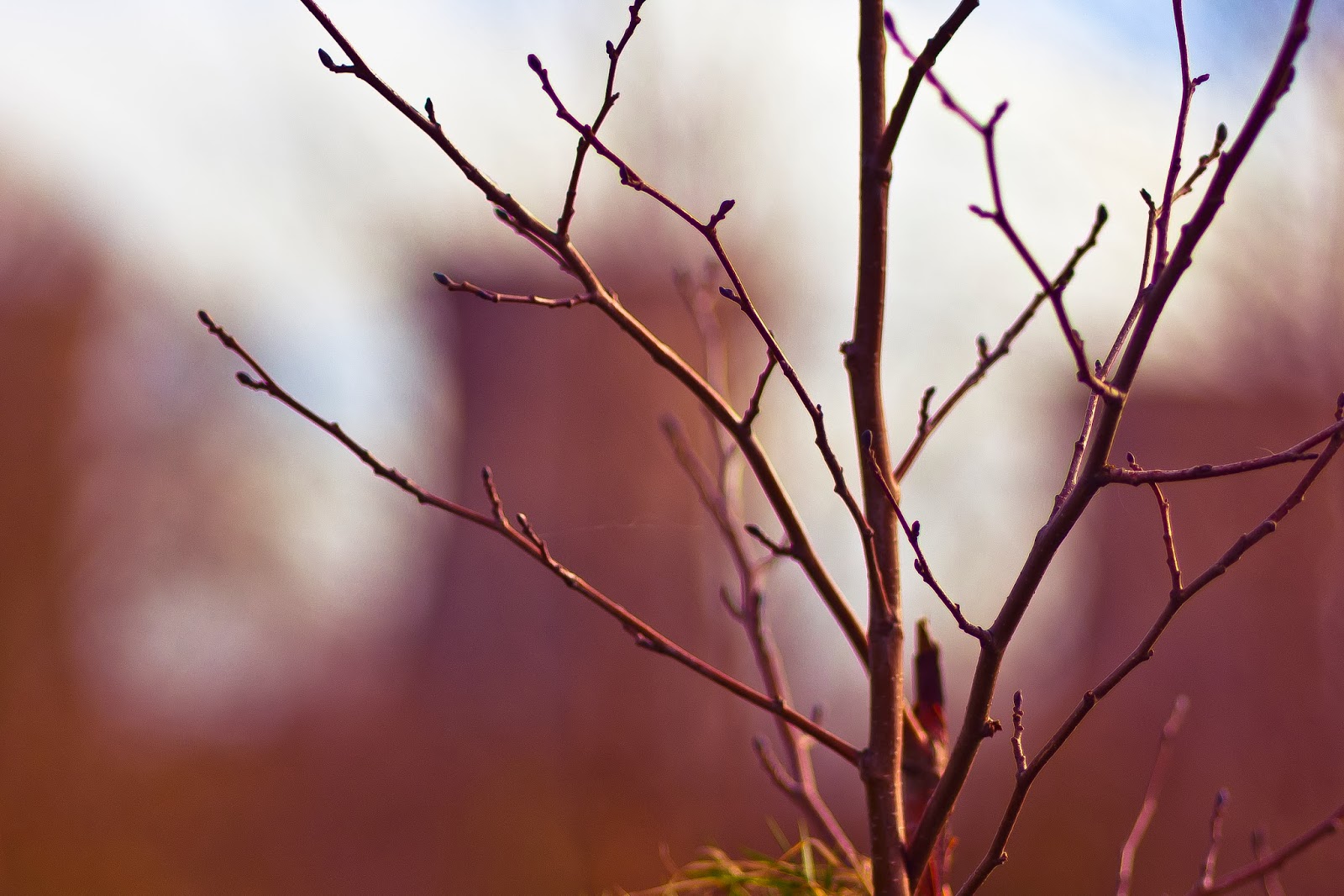
These photos were a small selection I had made from the many I had taken that represented a comparison between the two aspects of my project; Energy and Nature. Unfortunately, through my meticulous focus on the "aesthetically pleasing" I found myself post-processing it in a way that didn't best represent that idea. Thankfully, a few images stuck on. The first image was useful to see how such large objects block our view upon landscape, showing off the sheer scale and size of these power houses. I personally loved the second one, and would love to continue using it... although I cannot be sure if that would work until I've worked out a proper collection. The third one also can work if I choose to reprocess it and make it look a little more eerie and grubby, as that was the recommended aesthetic for my project.