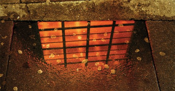
Rut Blees Luxemburg is a German photographer who's work is based around the general concept of 'City' using her own concepts to portray it in a unique way, she usually does this through taking pictures at night. Her night concepts tend to be shot in and around the urban areas of a city. The photograph below called "Piccadilly's Peccadilloes", which was taken in 2007, has a distinct reflection within the puddle. This reflection can be seen as a metaphor of herself looking upon the city that has dirty marks all over it, the weak orange light gives a sense of warming to it, yet we only see this through the reflection and it may be portraying an idealism that is far from the truth. The puddle itself suggests a dreary wet urban surrounding that may provide an insight into what the general consensus is in terms of emotion or outlook on life. The chewing gum could also hint at the size of the population as the many pieces have been squashed on the floor. This carelessness ties in with the wet dreary cement slabs that depict a certain negative mood. All in all, this photograph probably tells us what the city should be, but how it actually is.
In this next photograph "Folly", the general vibe continues to extend itself. This unconventional picture is also associated with the cit. Rut Blees Luxemburg has presented a flooded staircase, but leaves the viewer with any extra information about this photo, apart from the shadow seen of the camera used. The depth of this image is seen through the loss of light as it goes further on in distance from the camera. Some would suspect that this place may be underground as the staircase has growing limescale decaying the edges of the rails. This could depict a place hidden from general public and truly shows what actually happens in the city underneath the public. The true erosion and damage that having a city does is seen here and shown at it's best.

The third and final photograph by Rut Blees Luxemburg is a little different in it's conventions when compared to the two previous. It's angle is similar to the one above where it is skewed, probably trying to show something out of kilter. This particular one focuses all the way from top to bottom creating an immense sense of depth. The image tends to draw people's eyes towards the centre (which is at the bottom of the building) to give a true sense of height. The angle may suggest then that it's height is overwhelming, especially to those at the top. The concept behind this run-down imagery is probably to drive the viewer to believing in the negative impact large buildings may be having.

The next photographer I will talk about is called Richard Wentworth, and he has created a photograph that is called "Bottlestick." What's interesting about this photograph is that it is less abstract than Luxemburg's work. Wentworth presents a bottle crammed between two trees central to the image, this simple representation of nature and a man-made object together shows the collision of two different worldly inhabitants. As much as the bottle 'fits' it does not present something that feels correct - it easily be viewed as out of place. This bottle also goes to show the carelessness presented by mankind to take care of the rubbish they create by consuming man-made products. Nature then takes the brunt of it and acts as an irregular disposal of something that individual simply did not want to own any longer. Morals could be brought into this.

Just like the previous photograph, the following one also has a similar moralistic background to it. The simple idea that a plastic cup could represent very similar concepts as previous. What's interesting is that Rut Blees Luxemburg focused on the buildings and their skyscraper character being overwhelming, whereas Richard Wentworth focuses much on the human's and the society's behaviour amongst the city itself, particularly when it comes to litter/rubbish. This very observation goes to show that as a society in the city, people are to blame and there needs to be change. This image communicates that brilliantly.

Vera Lutter is a photographer who has a tendency to present her imagery inverted, black and white. In this particular one, it could be directly comparable to night photography with all of it's dark shadows. This interesting aesthetic definitely presents itself as unique in comparison to the other photographer's imagery. This inversion makes our eyes focus on all of the brighter areas such as the windows. You could say it helps viewer's eyes focus on things completely differently. Because of the unfamiliarity of this type of image, we find ourselves looking at the vertical and horizontal lines that make up the image rather than the objects themselves. There is also a hint of ghosting above the buildings, maybe merging of two negatives. This makes the image seem very flat, and you start to consider the implications of Lutter's choice to make it inverted.

Another one of Vera Lutter's photographs focuses on a clearer subject. The similarly implemented technique of inverting the colours is present again as Lutter presents a symmetrical image as opposed to the previous. This one could be compared to the images of Rut Blees Luxemburg through the use of darker areas and more abandoned places. The image generally conveys a dark coloured feel that connotes a negativity too, almost to suggest that these tall buildings are getting too overwhelming - again, much like Luxemburg. These messages are all shared with us in an attempt to get our attention and work out that these city landscapes may have some issues work talking about in a worldly context.


