Monday, 28 April 2014

Heather Angel: Macro Nature

The development of my project has come to a pinnacle point of defining the close-up shots with the far-away shots in an attempt to fuse them together for a diptych style. This was made more apparent as my tutorials went on, and it was up to me to find a way of looking objectively at nature's subjects on the ground, and therefore I needed some visual inspiration. I soon stumbled upon Heather Angel, whose work greatly captured the intricate details within nature at a macro level. 


As you can see above, Angel has captured vibrant colours without completely saturating the frame and distracting from the subject itself. The slightly obscures shapes of nature have been made more prominent in this work, and it's something I wish to incorporate into what I'm doing for my final edit as I pick the final images for my own project.


Angel perfectly captures the fragile patterns and details within nature and showcases them without distractions. Although the black background suits the photograph, I believe in shooting on location without tampering with the subject at hand - this will mean blurry backgrounds, as successful macro shots often means having a shallow depth of field.


The beautiful patterns within these above images show a central focus where leading lines naturally flow towards. These carefully planned captures show a truly observant eye for nature, especially within macro photography. These weird and wonderful life forms are the exact subjects I have been on the hunt for whilst out trudging around the energy facility locations.


Sunday, 27 April 2014

Design Process: Logo Redesign

As part of my project development, we are required to resubmit professional practice associated items which include branding and relevant forms etc that all stem from a design brand. Thankfully, I have completed such a task, my design brand is all branching out from my newly modified logo below. As you can see, I've kept the same yellow colour and general concept but I've gone back and attempted to bring it in up into a more professional use of text and placement. 


I replaced the original font which was Century Gothic into something a little more universal and attractive. Helvetica was my choice, and I felt like it fit the design a bit more after plenty of reflection upon my submitted work from last year. It's also much more of an industry standard. I have also gone ahead and created two versions of my logo to save myself the trouble of limiting the alignment to one side of the page, so I have this version below too.


I have mathematically designed the new rectangular-styled yellow bubble which stems from the square logo, with the bottom protrusion being a perfect 45-degree angle where it sits. The size of the triangle will also perfectly fit into the carved out space of the opposite corner where the smaller black triangle sits. The black triangle purely sits there to keep the rectangular feel of the whole yellow block. All of this work has been built upon the unchanging square logo (top-right, bottom-left), as I felt this design was successful in what it was attempting to achieve. The logo itself can sit on a photo as a watermark wherever appropriate without having to display any words.


Wednesday, 23 April 2014

Sizewell (Photoshoot #5)

As a way to be completely sure I had all of the photos that I needed for my collection, I decided to do a final shoot in Sizewell, near Ipswich- this was to safeguard the amount of images and variety within the photographs. This location was very successful for it's array of subject matter and advanced the concept significantly. I had plenty of images in this photoshoot that were applicable to my idea, just as I did with the others, which made the selection process a little longer - but in the end it gave me more choice. Just as I've done before, I've only selected a small fraction of the actual amount of images taken to save repetition and similarity within displaying my test images.


Saturday, 19 April 2014

Cliffe & Grain (Photoshoot #4)

Whilst I felt like I had made significant progress on the previous photoshoot, I thought there was no reason why I shouldn't go out again. I went to Cliffe to photograph some nearby energy facilities. I managed to get some great far away shots and also some close-ups within the area. I have again selected the best of the bunch from the photoshoots despite having up to one thousand images from the full day. These photos were steering my project in a new direction which highlighted the naturally beautiful delicate fragments of nature in comparison to the large cumbersome trates of the industrial facilities.


In these images I ended up travelling to the Isle of Grain again, except to take photos from a different angle. I explored the place with my 105mm Macro lens to grasp a closer up feel of the location. I ended up discovering new views and some fantastic photos that include reeds and wheat in plentiful availability. 


Sometimes, as much as these wires fill up the skies, you can still appreciate the glow of the natural evening sky. The messy tangle of metallic pylons cascade into the distance and yet it doesn't stop you from seeing the beauty behind it. The pylons create a subject, but the nature create's a background, especially in these pictures.


Tuesday, 15 April 2014

Chernobyl: 28 Years Later

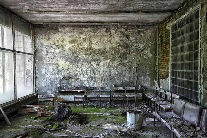
Energy facilities are the main subject matter of my project, and in turn I have visited many places around the UK to see how they disrupt the landscape around them visually. But in this instance, there has been an actual disruption of the landscape, and on a large scale; Chernobyl's nuclear disaster rendered the place uninhabitable. The nuclear disaster happened just over 25 years ago, and to this day it remains a desolate and empty space.


Here you can see in the image above, the remains of life, an eerie shadow of what was once there. But it stands to reason that our destructive nature can bring upon grave danger to life surrounding these energy facilities, and the fragility of which we operate within these sciences makes me uneasy. There are instances of these types of things happening again, in Fukushima as an example. 


The facility lost stability on the 26th of April 1986, and it was the biggest disaster Ukraine had had in years. Many particles spread into the atmosphere after the event took place, putting the neighbouring towns and cities in jeopardy. Such a disaster would not be witnessed in a coal power plant or other through uses of other green energies. We have sabotaged our future with these structures that obscure the natural view and cause potential harm to those involved with these projects. There are claims that we have put measurements in place to prevent this from happening again, but we have witnessed that this isn't entirely the case yet.


Thursday, 10 April 2014

The Diptych Layout

Sally Mann

Sally Mann is an American Photographer who is best known for her photographic work of her children. There are some candid shots, but there are some clear constructed photographs of her children, especially the one found in diptych format. The imagery itself is largely irrelevant to my project, but the syntax behind creating comparison imagery is all so very interesting. In this instance, "Jessie at 12" as it is named, presents itself as a transition of Sally's daughter Jessie as she progresses from having her hair extremely long to it being cut extremely short, and the contrast of hair length. These two similar images force you to find differences and similarities, naturally, as the subject material's placement achieves this with minimal space between both sides.


Olga Zavershinskaya

In this next diptych, Olga shows a Fine Art style fashion diptych. The material covers each half the woman, showcasing the nude body for all it is, but only within half of each photograph. This half reveal for each side is fascinating, along with the curvature of the material stretching off out of the framing. This is a prime example of how a diptych can show two sides to a narrative, creating a more compelling story that would be less successful if they were separated. The success of the imagery is dependent on these two being together.


Cherry Key

In this next example, the diptych provides context to the landscape. The trees within the eerie woods, showing a lot of subject in the distance, along with an overarching and bare tree. Then on the right, you're presented with a close-up at the scene, something providing you with information of the ground this photographer stood upon. You are treated to the view of the leaves that have fallen, their origin presented within the first frame.


Monday, 7 April 2014

Project Direction: Dungeness (Photoshoot #3)

My project has developed dramatically since the initial start of shooting. I have found myself reshooting time and time again refining which images are going to be pinnacle to my idea, and this means discarding a lot of images that I feel would have been liked by the audience, but due to their more aesthetically pleasing nature I have had to cut them out.

Dungeness was the next location on the list to visit, and sure enough I made a day out of it, providing myself with plenty of material. Here is a small collection of some of the shots I had taken:


These images are unedited, the only modifications would have been in-camera as they saved as a RAW and JPEG. This is only a small fraction of the roughly 1000 photographs that I had taken. A refined pick, if you will. But even then all of my favourites are not present.