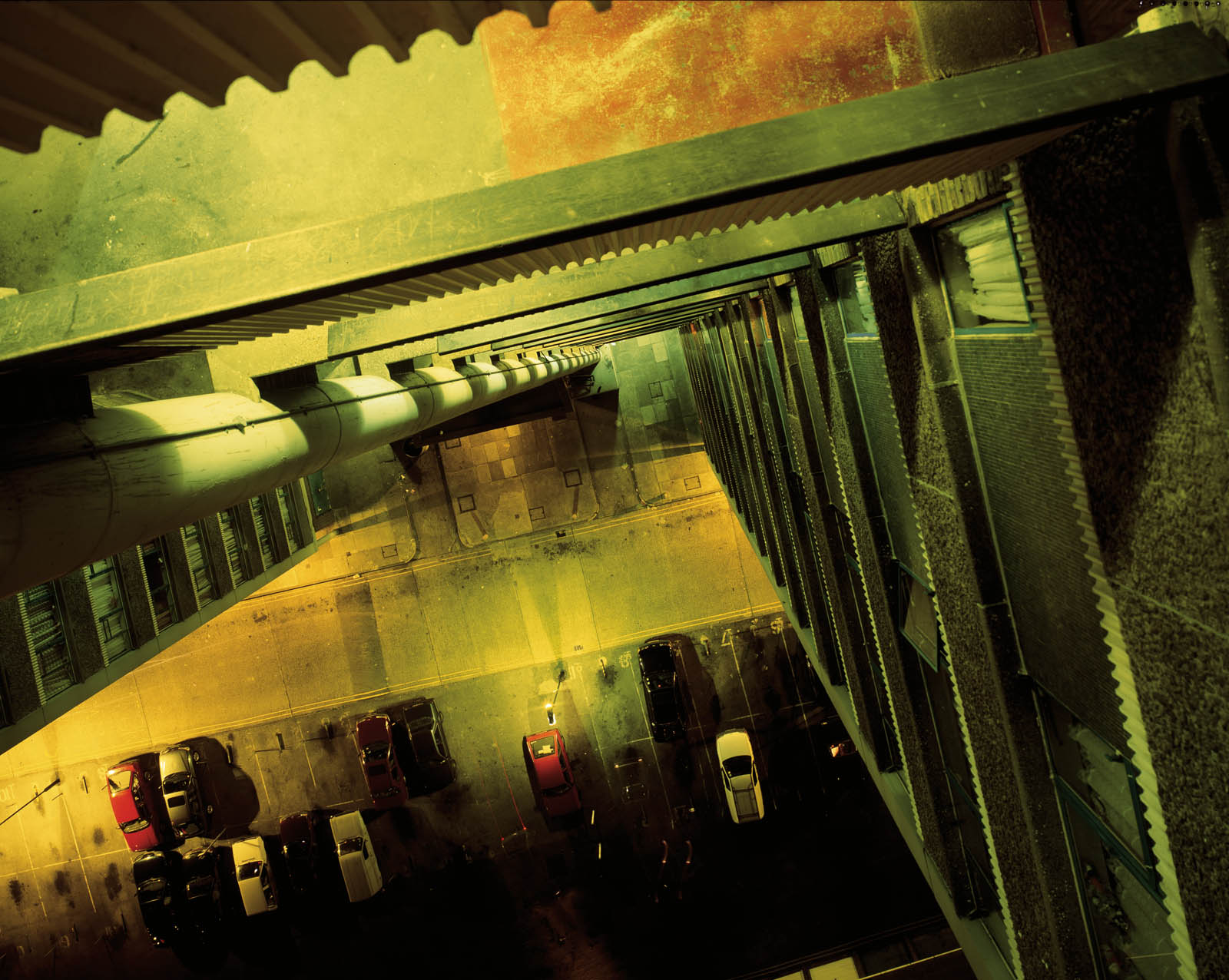
One of my most admired photographers is Rut Blees Luxembourg, but likely for the wrong reason. The overall aesthetic of her work truly inspires me to follow in her footsteps and choose to shoot ambient evenings with urban cityscapes falling off into the background. The photography she employs holds lesser significance to me in regards to the depth and meaning behind the long exposures, the technique of using longer exposures in these darker urban places truly gives a nocturnal ethereal aesthetic that is unique in itself, and that inspires me to create a unique brand of style for myself whilst shooting my own photography.
I often find that she has brought me closer to my photographic ability, the style has aided me in my work countless times as I try to replicate the ambiance she holds so brilliantly. The interesting colours certainly influence my choice in modifying the candid colours of a regular photograph I've taken. I make it my own work by using colour filters that give it a visual signature that hopefully translates clearly through my photography. Her work, to me, is less about meaning and more about visual appeal.
Rut Blees Luxembourg chooses to challenge herself when framing an image by finding difficult angles and unusual vantage points. In the first photo we are greeted by a extremely low down shot to create a sense of depth trailing up the photo, but down the stairs. The rounded edges of the wet stairs reflect the ambient light from the streetlights whilst the rain/water has simulated a flat sheet look due to the longer exposures she chooses to use.
In the second photo, you're given fragments of reflected light through the multiple puddles created through poor road maintenance, this creates a jagged photo of mosaic like highlights. the closer light at the bottom of the photo shows the lighter (likely dry) pavement with all its cracks shown in the frame. This run down area has become something aesthetically beautiful with the usage of light.
In the last photo, the interesting hues of colour differ from the usual orange tint we expect in an urban landscape, combining that with the top-down view and the leading lines, you have a urban piece of art even before you know the story behind it. The contrast in all three truly brings a sense of mystery, the hidden attributes of the character deep within the frames.


No comments:
Post a Comment