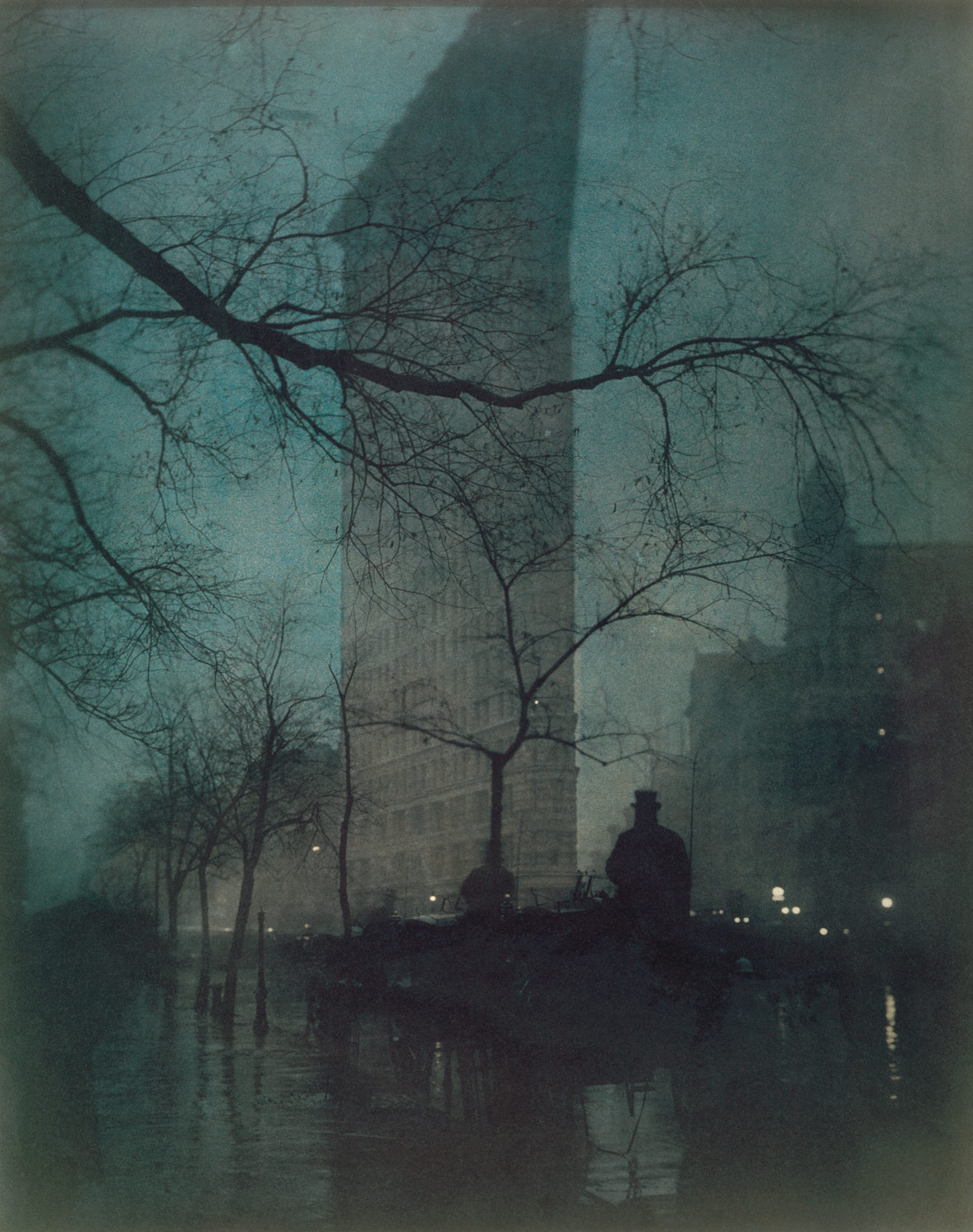
Edward J. Steichen was an American photographer, painter, museum and art curator. In his picture called “The Flatiron, New York” or better known as the Fuller Building, he depicts an eery yet rustic feel throughout his aesthetic and composition that gives an almost comforting silence about it. In this Platinum print, he experimented with different chemicals that would best show this building in a twilight surrounding. The lighting that has been applied to this photograph is there not to celebrate the erection of American buildings, but to show that it's existence is overwhelming amongst the natural foliage hidden in the subtle shadows. The building immediately snatches your attention from anything else not after long, as this simplistic graphical outline shows straight lines that are immediately compelling in a photo of other complex shapes. This image trait perfectly translates from the idea that these American buildings are filling up the sky with their structural existence, which in turn could be seen as a concern to people. The concept that Steichen was trying to deliver could have been one that spells the importance of preserving landscapes without large buildings obscuring everybody's view, but all in all, this picturesque scene is most likely depicted negatively through the use of this building.
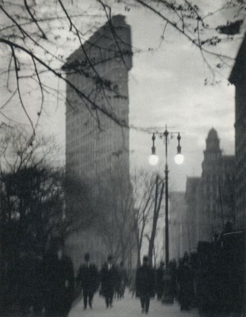
Alfred Stieglitz was also an American Photographer who constructed his own view of the same place. This photograph, taken a few years before Steichen's, builds it's own narrative that shows the building as a binary opposite to that of the nature in the foreground. The tree falls into the rule of thirds but as for the background, there is much to say about it's presence – The Flatiron makes itself known through it's greyscale structure, amongst the snowy white edges of the trees that stand between it and the tree in the foreground. This similarly translates a forboding existence amongst surroundings, just as Steichen does in his, accept the focus is taken off of the building donating some of it towards the fork in the tree. The appeareance of a snow white flooring gives the builing a sense of scale amongst everything else to emphasis just how big it may be. There is a much larger tonal range in this photograph too which adds to it's aesthetic contrast. If you're clever, you can also spot where he took this photo – using the photo above! This photograph is much more journalistic by nature, than that of it's picturesque counterpart above.
Alvin Langdon Coburn shows “The Flatiron Building” which was taking in 1911 almost a decade after Stieglitz's one, and it has a much busier feel to it. The movement that is seen in this photo can be depicted as harder to take in visually. The motion blur and lens blur present also adds to the real lack of clarity given to this photograph. Out of the first three though this is the first one to have people involved, even if they aren't the focus, and are all generic business men. This structure always seems to give off the same charactistics within each photograph, even if it's not intentional. That real sense of an overwhelming structure amongst all else is a common one. Some people would suggest that this was taken in the early evening, as the lights are on, but the musky overcast sky is still light. The lighting from the streetlights do not give off much benefit to those walkers which can be another indication. Interestingly enough, all these photos have been taken in the colder seasons, which may help viewers have a similar view of the building to these photographers. This slightly depressive view doesn't do any good to those in favour of this building's existence.
Walter Gropius has a different take on it. “The Flatiron Building, New York” as it is so aptly named, shows off the Flatiron building itself in a much more rewarding light. The camera angle Gropius has gone for pointing upwards really boasts this structure's greatness, and amongst other things, shows the softer edges it has. The curves are accurately captured along with the camera being tilted so that the building can fit corner to corner, this sense of “fitting it in” goes further to show it's monumental scale. Although there is fairly even light coming from an empty sky, the overall lighting is high-key. Gropius was known to capture architecture from a beneficial angle, so this is expected. This differs greatly to that of Stieglitz's, which gives off a colder, darker and more figuratively evil charactistic when compared to this more majestic impression. The free space in the photograph makes it visually easy to take in, especially with the obvious edges to buildings in it. There is almost a distinct lack of foliage or nature altogether, excluding the sky itself. This promotes the existence of such buildings and naturally goes on to say that they are more important than the trees that surround them.
Walker Evans' “Flatiron Building seen from below, New York City” is probably the most unique out of all of these, as he has approached the building close up, catching the finer details that the other Photographers may have missed, such as the windows. There is also an even amount of space taken up visually, with the light being a key feature that the eye is drawn to. Walker Evans gives us viewers a nicer angle to really appreciate its the scale from below. The lighting in this photograph is high-key, along with the overall image being high contrast. The light shimmering along the edge of the Flatiron has a nice gradient to it. This gradient amongst the other shadows and highlights in the image makes this compelling to gaze upon, especially since we cannot be sure at which angle we are seeing this ate. The similarities these photos can all share is the overcast sky and the straight edges. The light is really the key feature as to when this was taken though, as the design would not be found in modern day New York. The overall slight sepia toning gives this image a warm finish, probably due to the Gelatin Silver printing.
This photograph of Berenice Abbott called “The Flatiron Building” is the most original in some people's opinions, as it evenly shows scale, straight vertical edges, and plenty of clear empty space. This almost vector-like photograph is different the previously shown and I think Abbott was going for a much more modernistic approach as there is much definition and contrast within this photograph. Through all of the photos shown though, there is a clear line between those in favour of overbearing structures, and those who do not appreciate them. I think that much can be said in favour of having them rather than not.


No comments:
Post a Comment