Tuesday, 11 March 2014

Mini Photography Tour (Photoshoot #2)

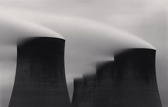
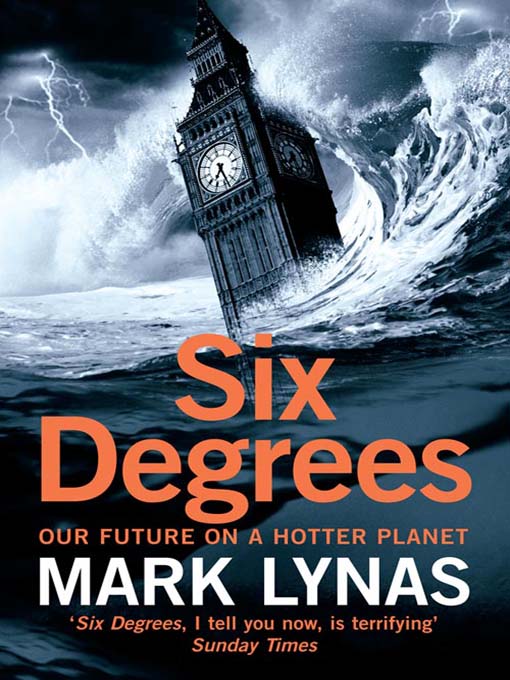
Naturally, because my project involves photographing these power stations, I went away for a few days to visit select locations of some of them. The facilities I planned on visiting (in no particular order) were Ratcliffe Power Station, Didcot Power Station A, Iron Bridge Power Station, and Willington Power Station spread over a 3-day period. As I went through each location I found myself compelled to photograph the nature that was surrounding these locations as it was withering and dying. This may not be a direct result of all the facilities' existence, but it certainly pointed in the direction of them being somewhat responsible for the nature of our planet and it's response to the CO2 emissions we so carelessly release.


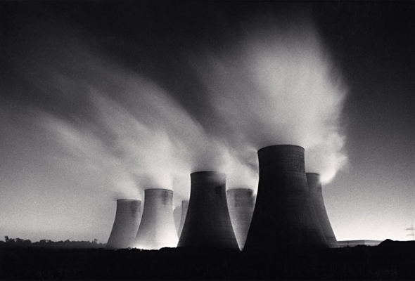
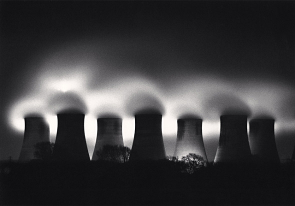
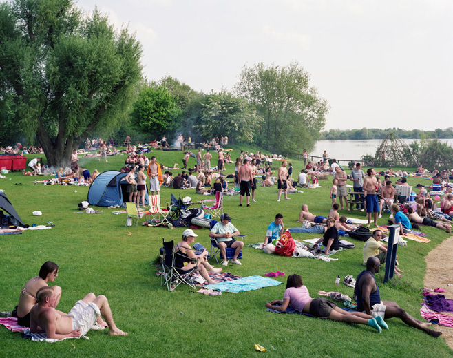
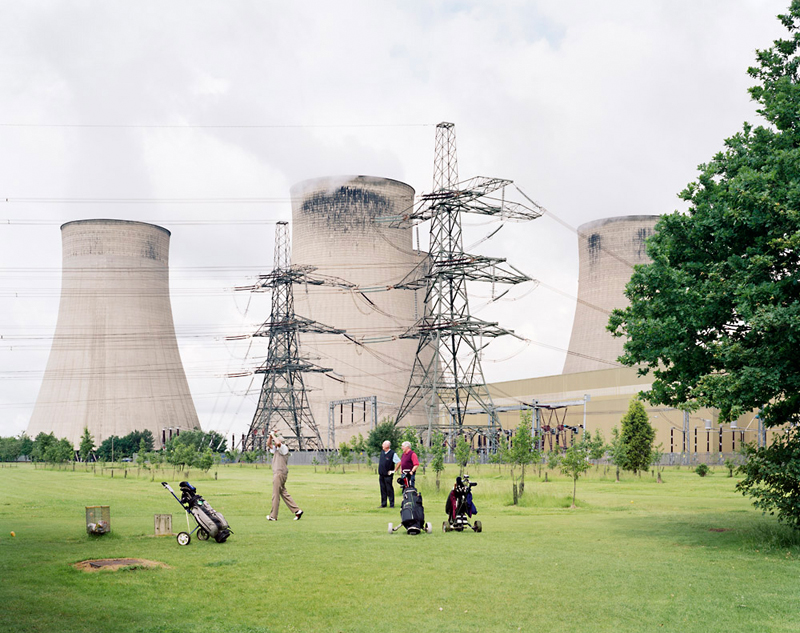
These photos were a small selection I had made from the many I had taken that represented a comparison between the two aspects of my project; Energy and Nature. Unfortunately, through my meticulous focus on the "aesthetically pleasing" I found myself post-processing it in a way that didn't best represent that idea. Thankfully, a few images stuck on. The first image was useful to see how such large objects block our view upon landscape, showing off the sheer scale and size of these power houses. I personally loved the second one, and would love to continue using it... although I cannot be sure if that would work until I've worked out a proper collection. The third one also can work if I choose to reprocess it and make it look a little more eerie and grubby, as that was the recommended aesthetic for my project. 


Thursday, 6 February 2014

Michael Kenna: Power Stations

Michael Kenna is a photographer I've stumbled upon through my researching. His fantastic photos of power station chimneys truly present a powerful feel to them. He took them all in black and white, and this limitation truly allows you to focus on the tonality, contrast, and texture of these longer exposures. The sky is soft, and well as the smooth whispy smoke given away from the chimneys. The project was long-lasting, capturing them between 1984 and 2003. It shows little in the way of change, which is usually what you'd see from a long span of time.


Ratcliffe Power Station, Study 2, Nottinghamshire, England, 1985


This dark feel mixed with longer exposure truly shows off what these giants structures are giving off, as they blend in with the rest of the sky clouding up. These much darker tones of the chimneys paint them in a more questionable light, revealing only little details of the edges, compared to the lighter grey sky that it's output merges with. The shadows of the CO2 give it a true sense of depth. The alluring smoke gently floats away, unknowingly harmful towards the environment that surrounds it.


Ratcliffe Power Station, Study 19, Nottinghamshire, England, 1984


This photo has a more distant and removed vantage point which truly considers the scale of these  grey giants, the smoke in the image completely originating from the facility. You can see a clear sky which is blocked by this hazy hot gas which reflects the light. The light itself, pollution from surrounding areas, and from within the facility itself. It's almost a self-contained location; creating energy by burning, and using energy to show the towers doing it. 


Ratcliffe Power Station, Study 45, Nottinghamshire, England, 2003

This later study shows that the CO2 output has truly engulfed it's origin. The gas seeps through the gaps of the chimneys, concealing where they end, suggesting an endless fog of chimneys. The central nature of the photo shows the leading lines to the bottom centre part of the photo, with gradients upwards drifting out of visibility. The black within the shadows suggest a darkness, mixed with an aesthetic beauty of which the photo beautifully captures the moment, with a sense of guilt towards the admiration of this image.


Ratcliffe Power Station, Study 31, Nottinghamshire, England, 1987


At a greater distance still, you can truly see this lineup of Ratcliffe. The little ambient light given off likely artificial, although with the smoke cascading out the top, you cannot know for sure. Thicker near the rim, the smoggy build up shrouds the beauty of the night sky, barely breaking out to show the stars. It goes without saying that this photo is of the highest contrast, which works well with the black and white style, although it leaves a lot of detail out, which can be both good and bad depending on the message. All of the remaining power station images can be found at the link below.
(http://www.michaelkenna.net/gallery.php?id=7)


Thursday, 30 January 2014

Rut Blees Luxembourg: Urban Landscapes

One of my most admired photographers is Rut Blees Luxembourg, but likely for the wrong reason. The overall aesthetic of her work truly inspires me to follow in her footsteps and choose to shoot ambient evenings with urban cityscapes falling off into the background. The photography she employs holds lesser significance to me in regards to the depth and meaning behind the long exposures, the technique of using longer exposures in these darker urban places truly gives a nocturnal ethereal aesthetic that is unique in itself, and that inspires me to create a unique brand of style for myself whilst shooting my own photography.

I often find that she has brought me closer to my photographic ability, the style has aided me in my work countless times as I try to replicate the ambiance she holds so brilliantly. The interesting colours certainly influence my choice in modifying the candid colours of a regular photograph I've taken. I make it my own work by using colour filters that give it a visual signature that hopefully translates clearly through my photography. Her work, to me, is less about meaning and more about visual appeal.


Rut Blees Luxembourg chooses to challenge herself when framing an image by finding difficult angles and unusual vantage points. In the first photo we are greeted by a extremely low down shot to create a sense of depth trailing up the photo, but down the stairs. The rounded edges of the wet stairs reflect the ambient light from the streetlights whilst the rain/water has simulated a flat sheet look due to the longer exposures she chooses to use. 

In the second photo, you're given fragments of reflected light through the multiple puddles created through poor road maintenance, this creates a jagged photo of mosaic like highlights. the closer light at the bottom of the photo shows the lighter (likely dry) pavement with all its cracks shown in the frame. This run down area has become something aesthetically beautiful with the usage of light. 

In the last photo, the interesting hues of colour differ from the usual orange tint we expect in an urban landscape, combining that with the top-down view and the leading lines, you have a urban piece of art even before you know the story behind it. The contrast in all three truly brings a sense of mystery, the hidden attributes of the character deep within the frames. 

Tuesday, 14 January 2014

Edward Burtynsky: OIL

This incredible photographer (based in Toronto, Canada), completed a series with very vivid and colourful images that looked upon the great industrial landscape of oil refineries and facilities with a powerfully critical eye. This impressive project resonates completely with the message I intend to portray within my own work, albeit his imagery is both devastating and beautiful at the same time.
“[we] come from nature.…There is an importance to [having] a certain reverence for what nature is because we are connected to it... If we destroy nature, we destroy ourselves.” 
His complete connection with nature and the awareness of our actions implies he is knowledgable about this subject, and the imagery certainly shows his knowledge through the beautiful photographs he creates. The desolation resonates so truly with a world we are hidden from. In the image below, the landscape is almost alien to us, where we would expect green fields and a bluish water running through it - yet we are presented with the opposite, a black landscape with bright red waters flowing though.


What a world we live in. The image above scares me, although in reality it holds little harm. This orangey-red deposit is the leftover of oxidation of iron whilst the nickel separation occurs. The image below shows a plethora of nodding donkey oil wells on the 'oil field' taken in Belridge, California, 2003. The very idea that we as a society must usurp our planet dry so that our landscapes hold little left in the form of oil or gas presents us with a world where we would need to come up with a solution that avoids using something of limited supply to fuel our energy-hungry world. In Burtynsky's oil images, it is the insatiable human hunger for the world's raw materials of which is primary interest to me. The tools of manufacturing are sometimes important, but they often function simply as a true measure of the immense scale of the scene before us.


The rest of the worlds I will leave in the hands of Edward Burtynsky himself, as they truly explain my feelings for such industrial behaviour. The origin and use of the materials has dawned upon me as something we must all be concerned about, not just photographers. His artist statement reads:

"When I first started photographing industry it was out of a sense of awe at what we as a species were up to. Our achievements became a source of infinite possibilities. But time goes on, and that flush of wonder began to turn. The car that I drove cross-country began to represent not only freedom, but also something much more conflicted. I began to think about oil itself: as both the source of energy that makes everything possible, and as a source of dread, for its ongoing endangerment of our habitat. I wanted to represent one of the most significant features of this century: the automobile. The automobile is the main basis for our modern industrial world, giving us a certain freedom and changing our world dramatically. The automobile was made possible because of the invention of the internal combustion engine and its utilization of both oil and gasoline. The raw material and the refining process contained both the idea and an interesting visual component for me."

The rest of his images within the set can be found at the web address below for all those who with to continue exploring his work and his important message he is putting across through it.
(http://www.edwardburtynsky.com/site_contents/Photographs/Oil.html)


Thursday, 9 January 2014

A Quick Look At 'Six Degrees: Our Future On A Hotter Planet'


This sobering book by Mark Lynas gives us a scientific look into a conceptual six-degree breakdown of what the world would come to roughly, if it were to endure these minute temperature rises. The book aims to show what each degree increase would bring, chapter by chapter. He speaks of endangered coasts, towns, rivers, croplands, and even mountains somehow. He brings a convincing argument to the table at the beginning of the book:

"Consider this: 18,000 years ago, during the deepest freeze of the last ice age, global temperatures were about six degrees colder than today. In that frigid climate, ice sheets stretched across North America from sea to shining sea."

This breathtaking fact truly puts the fact into perspective - if we can go from ice sheets covering all of North America to our currently acceptable habitat now with just six degrees increase in heat, just thinking of the implications of a further six worries me a little, the living conditions before dangerous for all of the world, not to mention the sheer damage it would bring to the extremely well established 1st world culture, with all the buildings and roads placed, homes built with current lifestyles in mind, and much more. The UK is barely ready for extreme weather, if anyone can recall what any winter is like here in the UK, then you'll know what a disaster it is. A layer of snow can disrupt even the biggest of cities. If our planet is to get hotter, the general idea is that the heat will melt the ice at both the North and South Pole, creating a rising sea level and massive increase of weather change.

The first degree speaks of changing landscape, dust bowls back in America, but with vengeance. Already, the world has risen 0.7 degrees in the last 10 years. A dangerous number to hear for such a small period of time. This one degree will bring an increase in hurricane activity. The second degree would begin the release of all green houses gases, and they will surely affect the ocean. There will be severe crop losses at a cost of billions, and forest fires would become common. It's predicted a 3rd of all wildlife would die off as a result of this second degree. At the third, Africa will get rainfall back, but the southern part would dry up to become almost inhabitable. At this temperature, sea levels are easily a metre higher. The fourth degree would see a collapse of civilisation, leading to worldwide conflict, and 70% of the Mediterranean summer rain would fail to fall for an additional 65 days. At the fifth, there will be no ice, no rain forests, floods, droughts, and the Earth would become unrecognisable, deserts would expand dramatically. The certainty of humans living is unknown at the sixth degree.

If I may, a quote from the film "The Day After Tomorrow" talks about the reversing of the North Atlantic current, something which brings about devastating weather as you may witness within the film. This source may be fictional, but the danger is there. Needless to say, Mark covers all of this in his book and more. The stark contrast of rising sea levels with sandstorms and droughts would be thought as common, we as a society should want to avoid such a perilous world. As a photographer, I feel as though I should make my contribution towards convincing those who are skeptical, by showcasing the damage which is kickstarting this destruction upon our planet.

Friday, 27 December 2013

Simon Roberts: We English

'We English' describes the project of which Simon Roberts has documented much of the English heritage and lifestyle held within a large exhibition, with the focus mainly being with landscapes and their incredible visuals that they behold. He would photograph people at a distance, almost as a tip of the hat towards classical painting, but in a modern and contemporary manner. His objective almost clear way of photographing is inspirational for a documentary type landscape, and it encourages me not to worry too much about creating a photographs individualism so much, whether that is intention or not.


The image above is a classic example of such a British photograph, showing many people gathered for a fairly overcast day, a few making BBQs for food - which is all fairly British. The real image in question I choose to dissect out of its collection to show separately, as I feel its significance to my project cannot go unheard. Simon Roberts, who came and spoke at UCA last year, showed a diligence to complete his work for this project and keep the method the same running throughout, which I think is something important to remember.


I have spoken about this image before as a very influential piece for those concerned with tackling the subject of climate change in general, but it feels that there's a certain ignorance with these golfers that cannot go unnoticed. The dull, grey subject matter of the background has become like a numb pain to all those surrounding, people have become accustomed to the smoke rising from the towers commonly known as chimneys, although I feel this misrepresents their size. Visually, I feel there is a divide between the foreground and background, much like Mitch Epstein's work before - the green grass and edge of the tall tree shows nature blossoming, with a few trees in the background next to the cascading grey matter which proceeds afterwards. There are definite binary opposites at work - you could cut the image in half and wouldn't expect to see either subject matter featuring on both images.

The place of which this was taken is Ratcliffe-on-Soar, which is in Nottinghamshire. Such a place like this cannot go unnoticed, and I plan to make a trip to see the facility as soon as I possibly can, along with a few others. Once I have accumulated 3 or 4 places to see, I shall do a little tour around a few places in UK so that I may too gather my own material.


Thursday, 5 December 2013

BBC Documentary: When Coal Was King

I've taken it upon myself to watch the BBC documentary about Coal miners back in the 1950s, where they would decidedly record every moment they could of the social, economical, and industrial differences and advances as they were happening. On the January 1st, 1947, signs were affixed to all collieries to say that they were to be managed by the National Coal Board, something that was born out of the labour government on behalf of the people. The declaration of focus upon Coal was a way in which the country publicly declared it's social renewal after World War 2. This then prompted the NCB to set up the film unit so that they can document every happening of the coal industry.


This is a screenshot taken of the BBC programme in which they hung the signs declaring the newfound existence of the NCB. Every month, 'The Mining Review' was a reel of film or a cine-magazine at a fairly short length of 10 minutes which was sent out to cinemas for all the millions of people within the public to keep up-to-date with the happenings of the mining world. One particular place it was shown was London's West End theatre, among 800 other cinemas. This was all to make sure that the public were all kept informed of the mining as they were now partly paying for it through their tax contributions, but it was also to show the mining communities at work and at play, and how those two things converged in such a thriving industry. 


Each mining review often followed a formula; firstly it would show technical information highlighting the latest developments within the mining industry. The rest of the short film would show arts or music, showing content created by the mining community in their spare time, finishing off with a story that usually promoted the benefits of mining. These fascinating archives were a truly successful way for the general public to give approval to mining coal. The labouring hours that were put into a typical worker's day kept many people employed during the few decades in which it thrived, but thanks to Margaret Thatcher's conservative party being in power during the UK miner's strike, many were turned by the success of Coal, and it's popularity decreased considerably. This was probably a good thing in the larger scheme of things, as it brought Coal under a more critical light, proving to many that it wasn't going to be a sustainable source, and the mining review films showed that desperation.


As the mining review clips were nearing their end, you could see the signifiant resounding words to be true, where it was mentioned that Coal would "not only power us for the next 40 years, but also for the next 400 years", which was the truth, but it failed to mention that there were other forces in play. The environment certainly took its toll during this period, and the implications from current modern ideas investing in wind farming and solar panels are a clear sign that many people are acknowledging the problem that exists.