Monday, 21 November 2011

Environment 6-Image Analysis

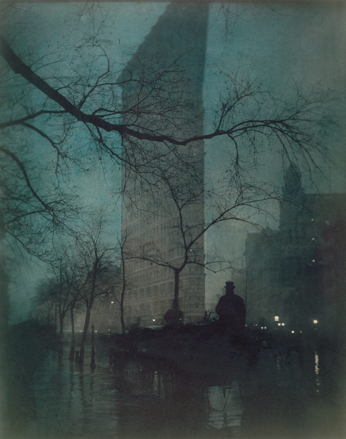
Edward J. Steichen was an American photographer, painter, museum and art curator. In his picture called “The Flatiron, New York” or better known as the Fuller Building, he depicts an eery yet rustic feel throughout his aesthetic and composition that gives an almost comforting silence about it. In this Platinum print, he experimented with different chemicals that would best show this building in a twilight surrounding. The lighting that has been applied to this photograph is there not to celebrate the erection of American buildings, but to show that it's existence is overwhelming amongst the natural foliage hidden in the subtle shadows. The building immediately snatches your attention from anything else not after long, as this simplistic graphical outline shows straight lines that are immediately compelling in a photo of other complex shapes. This image trait perfectly translates from the idea that these American buildings are filling up the sky with their structural existence, which in turn could be seen as a concern to people. The concept that Steichen was trying to deliver could have been one that spells the importance of preserving landscapes without large buildings obscuring everybody's view, but all in all, this picturesque scene is most likely depicted negatively through the use of this building.


Alfred Stieglitz was also an American Photographer who constructed his own view of the same place. This photograph, taken a few years before Steichen's, builds it's own narrative that shows the building as a binary opposite to that of the nature in the foreground. The tree falls into the rule of thirds but as for the background, there is much to say about it's presence – The Flatiron makes itself known through it's greyscale structure, amongst the snowy white edges of the trees that stand between it and the tree in the foreground. This similarly translates a forboding existence amongst surroundings, just as Steichen does in his, accept the focus is taken off of the building donating some of it towards the fork in the tree. The appeareance of a snow white flooring gives the builing a sense of scale amongst everything else to emphasis just how big it may be. There is a much larger tonal range in this photograph too which adds to it's aesthetic contrast. If you're clever, you can also spot where he took this photo – using the photo above! This photograph is much more journalistic by nature, than that of it's picturesque counterpart above.


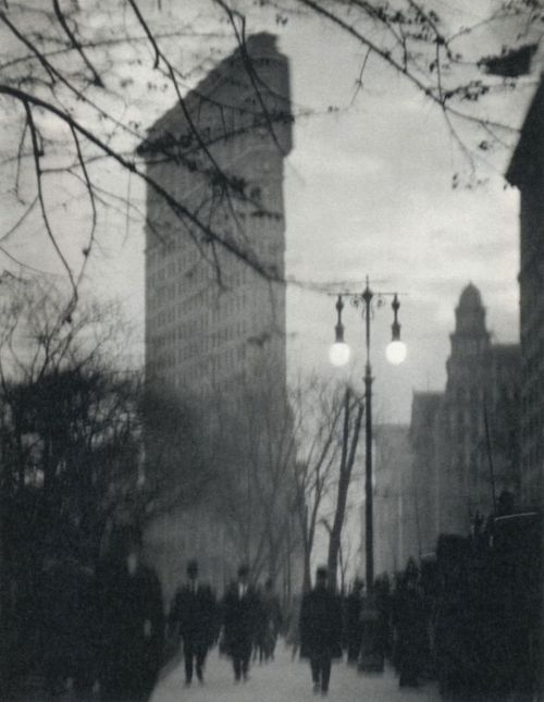
Alvin Langdon Coburn shows “The Flatiron Building” which was taking in 1911 almost a decade after Stieglitz's one, and it has a much busier feel to it. The movement that is seen in this photo can be depicted as harder to take in visually. The motion blur and lens blur present also adds to the real lack of clarity given to this photograph. Out of the first three though this is the first one to have people involved, even if they aren't the focus, and are all generic business men. This structure always seems to give off the same charactistics within each photograph, even if it's not intentional. That real sense of an overwhelming structure amongst all else is a common one. Some people would suggest that this was taken in the early evening, as the lights are on, but the musky overcast sky is still light. The lighting from the streetlights do not give off much benefit to those walkers which can be another indication. Interestingly enough, all these photos have been taken in the colder seasons, which may help viewers have a similar view of the building to these photographers. This slightly depressive view doesn't do any good to those in favour of this building's existence.


Walter Gropius has a different take on it. “The Flatiron Building, New York” as it is so aptly named, shows off the Flatiron building itself in a much more rewarding light. The camera angle Gropius has gone for pointing upwards really boasts this structure's greatness, and amongst other things, shows the softer edges it has. The curves are accurately captured along with the camera being tilted so that the building can fit corner to corner, this sense of “fitting it in” goes further to show it's monumental scale. Although there is fairly even light coming from an empty sky, the overall lighting is high-key. Gropius was known to capture architecture from a beneficial angle, so this is expected. This differs greatly to that of Stieglitz's, which gives off a colder, darker and more figuratively evil charactistic when compared to this more majestic impression. The free space in the photograph makes it visually easy to take in, especially with the obvious edges to buildings in it. There is almost a distinct lack of foliage or nature altogether, excluding the sky itself. This promotes the existence of such buildings and naturally goes on to say that they are more important than the trees that surround them.


Walker Evans' “Flatiron Building seen from below, New York City” is probably the most unique out of all of these, as he has approached the building close up, catching the finer details that the other Photographers may have missed, such as the windows. There is also an even amount of space taken up visually, with the light being a key feature that the eye is drawn to. Walker Evans gives us viewers a nicer angle to really appreciate its the scale from below. The lighting in this photograph is high-key, along with the overall image being high contrast. The light shimmering along the edge of the Flatiron has a nice gradient to it. This gradient amongst the other shadows and highlights in the image makes this compelling to gaze upon, especially since we cannot be sure at which angle we are seeing this ate. The similarities these photos can all share is the overcast sky and the straight edges. The light is really the key feature as to when this was taken though, as the design would not be found in modern day New York. The overall slight sepia toning gives this image a warm finish, probably due to the Gelatin Silver printing.


This photograph of Berenice Abbott called “The Flatiron Building” is the most original in some people's opinions, as it evenly shows scale, straight vertical edges, and plenty of clear empty space. This almost vector-like photograph is different the previously shown and I think Abbott was going for a much more modernistic approach as there is much definition and contrast within this photograph. Through all of the photos shown though, there is a clear line between those in favour of overbearing structures, and those who do not appreciate them. I think that much can be said in favour of having them rather than not.

Wednesday, 2 November 2011

Critical Appraisal

Critical Appraisal PDF

Wednesday, 26 October 2011

Environment - Pastiche test shots

Here you will find my Pastiche test shots, I took these in preparation for my film take, and to figure out the best position for my framing with what I had. After much searching, I found this great foliage on top of the local War Memorial hill.


Tuesday, 25 October 2011

Environment progress

Since the beginning of the environment unit, my ideas have been a slow moving development, and it was only until recently (the past few weeks) that I've been fully forming my idea. Obviously this isn't ideal as we've had a fair few weeks to get this part of the way. But since then I've been steered in the right direction in where I can take my idea and who I can look at. My idea is very much based around the idea of Light Pollution or Luminous Pollution, specifically on how much light our big cities and towns around the world are actually emitting, and making sure I reveal that and make people aware. You'll find that roads with streetlights and big buildings with large illuminated signs are actually fogging up the midnight sky, making it more difficult to actually see the beauty of the lights in the sky - stars, that is.

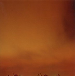
I've looked at Ori Gersht who has done some work very similar to my objective and he is spot on with his series called "Rear Window" which rightfully depicts landscapes with misty colours and soft focus which can all look quite beautiful - until eventually you find out what it's all about. Here below is one of the photos from his series that really shows attention to the sky, but merely peeping out of the bottom is a reference to the city skyline at his destination. It definitely picks up on the overpowering orange colour in particular, that is emitted from streetlights etc.


This work is a monumental help towards my goal, it will have to be my obligation to not copy his style, and be creative in making the work I produce, actually my own. For that, I turn to one of my most favourite Photographers Dan Holdsworth, to pick up on some key ideas that can help me make my work independent. He has done a series named "Hyperborea" that depicts a night sky with some unusual green colours due to the Reciprocity Failure of doing a long exposure lasting up to hours at a time. This creates a nice effect aesthetically, but it truly shows the sky's pollution at it's fullest. Here is an image from Dan himself showing it in action:


In terms of aesthetic, I can also turn to David Spero who's work is very similar to Dan's and has a some wonderfully soft imagery with perfect gradients that may be worth looking at so I can achieve a unique style of my own to present, here is one of the pictures from David's series so aptly named "Star Series", that presents quite clearly something I can aim for.

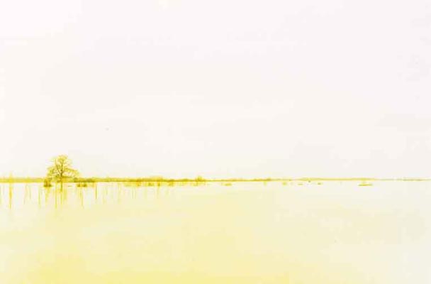
So I intend to work from here in terms of my idea, and I hope I can truly represent this as best I can, even  being limited to a medium format Black & White film stock. I hope to achieve this using a bulb setting through a timer which could indeed last up to hours, especially at an ISO 400, but it should be quite exciting and I look forward to shooting. Contact Sheet of my Pastiche attempts should soon follow. As a last look at other options of presenting my idea, there is also a photographer/artist named Elger Esser who takes a normal landscape and transforms it through overexposing the photo and putting it through a one colour filter attached to the camera. This does not show the light pollution, but does infact imply it through the use of over-saturation in one colour. 

Wednesday, 12 October 2011

Environment - Joel Sternfeld

In this blog post I will be writing about a photographer called Joel Sternfeld. He was born in New York City on the 30th of June, 1944 and is a large-format photographer who is known for his intriguing colour landscapes, especially as he helped establish colour photography as it's own artistic medium. Colour is considered a vital aspect of his photography to him, understandably too. In this first image of his below, you can see that he is sharing derelict train line that has been abandoned for quite some time as the vegetation grows in and around it.


In fact, this railway was built in the early 1930's to lift freight trains off of the street, so as you can guess, this is pretty old. It has been out of use for way over 20 years, and what Joel wanted to express here was it's absolute beauty. What you can see in this image is old rustic buildings in the background, that when compared to the railway, look ugly. The railway starts at the bottom of the photo covering the whole image, but as it continues, it veers to the left, and your eye is drawn upwards to the boring and mundane complex of repetitive windows and brown. This can be seen as a metaphor that explains the almost depressive transition from past into future, where buildings start to take over. 


Similarly, in this picture below, Joel has taken a low-angle shot looking onto the city, at the height of the tallest buildings adjacent to him. This long shot manages to capture a very large area of the city, showing off the population of the buildings. The railway is once again seen in the centre, with the vegetation seen mostly growing all over it. These buildings tower immediately next to the road which insinuates their importance on space. The railway looks out of place, and unwanted by it's surroundings, yet it still keeps the city from looking overpowering and too industrialised. Also, it being in the centre certainly draws in on it's importance as a feature of the city, which can separate it from looking mildly generic.


On this final image of his, you can truly get a sense of realism through looking at the fallen snow, and it differs in terms of how busy the image is, the centre of the railway on the right could most definitely be said to have fallen into the rule of thirds much like the first one. The pale colours are strangely refreshing when looked at in context, the almost slightly desaturated nature of the colours in the other two images produce a different feeling entirely. In the distance though, you start to see the skyline of generic tall buildings reappear - as an indication as to more of what is to come, which pulls at the sense of hope the railway has for it's natural roots. Mind the pun. Overall, the abandonment of the railway's industrial development "cleared the path" for nature to make itself known, giving opportunity to a vegetation that should be preserved, which in turn presents itself as a symbol for what every city should be aware of - letting a part of nature live within it.

Tuesday, 11 October 2011

Object Development - Todd McLellan


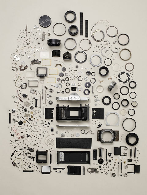
When thinking about my Object idea, I wanted to display a load of different phones and a few other gadgets that represent themselves as devices that can quite easily steal our time. Phones are obviously a classic example of this with their web-enabled capabilities, but there are a few others. When thinking about these objects, I wanted to display many in an ordered manner. When looking for inspiration, I stumbled upon Todd McLellan. Todd was born in Canada and was brought up encouraged to do photography by his Dad. He graduated from the Alberta's College of Art & Design with a Bachelor of Fine Arts in 2002 and since then he has done a lot of commercial work. Some personal work of his has most definitely intrigued me though. He has done a series of photographs where he dissembles objects and lays them all out in an ordered manner. The idea behind this seems to show a passion for how things work, a desire to see what makes up these objects - among them is a Pentax camera. 


If you look closely at all the tiny parts, you can see he has deconstructed it right down to the smallest of pieces, even the bolts are individually placed on the canvas. This shows a great attention to detail, you could even go on to say he was almost obsessed with seeing every part of the object to specify exactly what it fully consists of. This obsession ties in quite nicely with what I'm trying to trying to achieve with my own project, although there are differences obviously - the image above shows his own obsession, whereas my objective is to reveal people's obsession with technology. Regardless, this organised and systematic approach to displaying everything is something which inspires me. What you may also notice is that the smaller parts are mostly on the left hand side of the image, the main camera body parts are in the middle, and the larger more cylindrical shapes are on the right - this shows a great amount of order, when previously there must have been a well thought-out yet destructive process to get it down to all of these parts - to then re-organise it into something else. It's the idea that it can transform from one piece of art in the form of product design, and then through a destructive process, it transforms into a completely new piece of artwork - that artistic transformation through creative input is fascinating. 

Object Tutorial

I had my first group tutorial yesterday, which consisted of me presenting my ideas for the Object project. Unfortunately, due to my lack of initial passion and also my fixation on new lifestyle, I turned up almost empty handed. I soon scrapped some ideas together and ended up with something to do with Water and Light. It was very unspecific and only applied to the aesthetic I was aiming for, so unfortunately, I did not feel passionate about an issue. As my scrap of an idea was shown to be empty, tutorial moved on through the group where people’s ideas started to trigger the right thought process – I suddenly started to think about all the things in my life that concern me, especially of this moment in time, and I came up with a technology related idea – which always pleases me – I decided that I wanted to look at the obsession people have to constantly check their phones and to always check in with the 'second life' they have online – Facebook, Blogs, Twitter. People are constantly online, checking the news every few hours. People also spend so much time connecting through messaging systems such as SMS, BBM, Instant Messaging apps - and then there is the people that constantly play games too. All this time is spent aimlessly taking in information and outputting their own, almost disregarding the real life in front of them. So that is my starting point, looking at the obsession of technology. I think it’s all forward-moving from here on. Once I have a passion, I should have the drive to see it flourish and see the conclusion in all it’s beauty.